

SharePoint Copilot Apps: Bringing Interactive Experiences to Microsoft 365 Copilot
Introduction
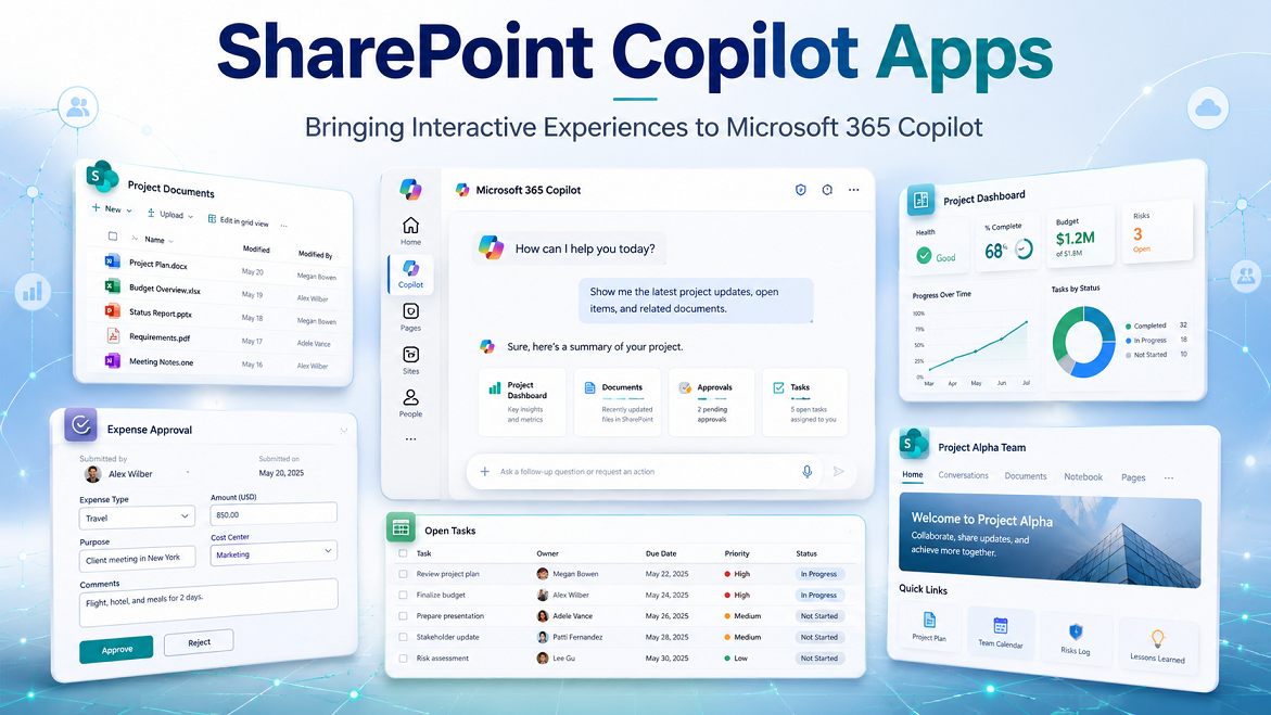
Microsoft 365 Copilot provides a conversational interface through which users can ask questions, generate content, summarize information, and interact with organizational knowledge. However, enterprise work does not always fit naturally into a text-only conversation.
Consider scenarios such as:
- Reviewing and approving an expense request
- Checking available leave balances
- Viewing a sales dashboard
- Selecting an office desk
- Updating the status of a service request
- Provisioning a SharePoint site
- Reviewing governance violations
- Selecting products from a catalogue
In these scenarios, users need more than a textual answer. They need forms, buttons, charts, cards, tables, filters, navigation controls, and other interactive elements.
SharePoint Copilot Apps address this requirement by allowing developers to create rich, interactive user interface components that run directly inside the Microsoft 365 Copilot experience. These components are built using SharePoint Framework, commonly known as SPFx, and packaged together with a Microsoft 365 Copilot declarative agent.
Instead of asking users to leave Copilot and open another application, a SharePoint Copilot App can present the required business experience directly within the Copilot conversation.
What Are SharePoint Copilot Apps?
A SharePoint Copilot App is an SPFx solution that contains two major elements:
- A Microsoft 365 Copilot declarative agent
- One or more SPFx Copilot components
The declarative agent understands the conversation, follows instructions, displays conversation starters, and determines which action or tool should be invoked.
The Copilot component provides the visual and interactive user experience. It can display controls such as buttons, cards, forms, tables, dashboards, charts, lists, progress indicators, and custom branded interfaces.
Both elements are bundled into a standard SharePoint solution package with the .sppkg extension and deployed through the SharePoint app catalog.
A simple way to understand the model is:
-
Declarative agent = conversational intelligence
-
Copilot component = interactive user interface
Together, they create an agent experience that can understand a user’s request and then display an appropriate application interface inside Copilot.
Moving Beyond Text-Based Responses
Traditional Copilot agents generally return a textual response, possibly with links or adaptive cards. This approach works well for questions such as:
- What is the company leave policy?
- Summarize this project document.
- Who is the owner of this SharePoint site?
- What are the main risks in this proposal?
However, text becomes less effective when users need to perform a structured action.
For example, suppose an employee asks: “Show me my pending expense claims.”
A text-based agent might return a list of expenses. A SharePoint Copilot App could instead display:
- A sortable table of claims
- Status indicators
- Expense amounts
- Supporting document links
- Approve or withdraw buttons
- A detailed view for each request
- Filters for date, status, or expense type
The user can review and act on the information without leaving the Copilot conversation.
Microsoft describes this model as bringing purpose-built UX components into Copilot at the moment they are useful, reducing the need for users to switch between portals, applications, and business systems.
SharePoint Copilot Apps and SharePoint Framework
SharePoint Copilot Apps are built using the SharePoint Framework development model.
Developers can continue using familiar SPFx technologies such as:
- TypeScript
- SCSS
- Heft
- Node.js
- React
- SharePoint Framework libraries
- Microsoft Graph
- SharePoint REST APIs
- Microsoft Entra ID-secured APIs
- Existing build and deployment pipelines
Although React is commonly used in SPFx solutions, developers are not restricted to React. The underlying UI can be developed with plain TypeScript or other JavaScript frameworks when appropriate. Microsoft’s current generator provides Minimal, No Framework, and React starter templates.
This is important for organizations that already have SPFx development experience. They do not need to adopt an entirely different development platform to create interactive Copilot experiences.
How SharePoint Copilot Apps Differ from SPFx Web Parts
An SPFx web part extends a SharePoint page. A Copilot component extends the Microsoft 365 Copilot canvas.
The two components use different SPFx base classes:
- A SharePoint web part derives from
BaseClientSideWebPart. - A Copilot component derives from
BaseCopilotComponent.
The base class connects the component to its host environment. However, the underlying React components, services, business logic, TypeScript models, and styles can potentially be shared.
For example, an organization could create a shared React component named EmployeeLeaveDashboard. The same component could eventually be hosted through:
- An SPFx web part on a SharePoint intranet
- A Microsoft Teams tab
- A Copilot component inside Microsoft 365 Copilot
Microsoft describes this as a “build once, reach every surface” model. During the current preview, however, SharePoint Copilot Apps render only in the Microsoft 365 Copilot user experience. Broader cross-surface support represents the direction of the platform rather than complete preview functionality.
How SharePoint Copilot Apps Work
A typical interaction follows these steps:
- The user opens the declarative agent in Microsoft 365 Copilot.
- The user enters a request.
- The agent interprets the request using its instructions and available actions.
- The agent selects an appropriate tool.
- Microsoft 365 Copilot invokes the tool associated with an SPFx Copilot component.
- Input properties are passed to the component.
- The component renders an interactive experience inside the Copilot canvas.
- The user reviews information or performs an action through the component.
For example:
User request
“Show the health of the Marketing SharePoint site.”
Agent decision
The declarative agent selects a site-health tool.
Component properties
{
    "siteUrl": "<https://contoso.sharepoint.com/sites/marketing>",
    "view": "governance"
}
Rendered experience
The Copilot component displays:
- Site owners
- Storage usage
- Sharing status
- Sensitivity label
- Last activity date
- Permission risks
- Recommended governance actions
The parameters supplied by Copilot control the initial rendering of the component. This allows one component to support multiple scenarios without creating a separate UI component for every request.
Main Building Blocks
1. Copilot Component
The Copilot component is the client-side UI element rendered inside Microsoft 365 Copilot.
It extends BaseCopilotComponent from the @microsoft/sp-copilot-component package.
A simplified component structure looks like this:
import { BaseCopilotComponent } from '@microsoft/sp-copilot-component';
export default class SiteHealthCopilotComponent extends BaseCopilotComponent<ISiteHealthProperties> {
protected render(): void {
const siteUrl = this.properties.siteUrl;
const displayMode = this.hostContext.displayMode;
// Render the component UI.
}
private async requestFullscreen(): Promise<void> {
await this.requestDisplayModeAsync('fullscreen');
}
}
The component receives:
- Tool properties
- Display mode information
- Host context
- Theme information
- A DOM element in which to render the user interface
The standard SPFx rendering approach can then be used to display a React application or another client-side interface.
2. Component Manifest
The component manifest defines:
- Component identifier
- Component alias
- Component type
- Supported display modes
- Tools exposed by the component
- Tool descriptions
- Input property schemas
A simplified example is:
{
  "componentType": "CopilotComponent",
  "copilotType": "Ux",
  "manifestVersion": 2,
  "capabilities": {
    "availableDisplayModes": [
      "inline",
      "fullscreen"
    ]
  },
  "tools": [
    {
      "name": "ContosoSiteHealthTool",
      "description": {
        "default": "Displays SharePoint site health information."
      },
      "propertiesSchema": {
        "id": "\$../../../lib/copilotComponents/siteHealth/SiteHealthProperties.js:default;"
      }
    }
  ]
}
Every tool becomes an action that the declarative agent can invoke.
Tool names should be meaningful and unique. During the current preview, duplicate tool names across separate deployed solutions may result in one tool being silently ignored. Microsoft recommends ensuring that tool names are unique across the tenant.
A naming convention such as the following can help:
<CompanyName><BusinessArea><Action>Tool
For example:
- ContosoHRLeaveBalanceTool
- ContosoITServiceRequestTool
- ContosoSPSiteGovernanceTool
3. Properties Schema
The properties schema defines the data that Copilot can pass to the component. The generated project uses Zod to define and validate these properties.
For example:
import { z } from 'zod';

const siteHealthPropertiesSchema = z.object({
  siteUrl: z.string().describe(
    'The full URL of the SharePoint site to analyze.'
  ),
  view: z.enum([
    'overview',
    'permissions',
    'storage',
    'governance'
  ]).describe(
    'The initial dashboard view to display.'
  )
});

export type ISiteHealthProperties =
  z.infer<typeof siteHealthPropertiesSchema>;

export default siteHealthPropertiesSchema;
Clear property names and descriptions are important because the agent uses these definitions to understand what information should be supplied to the tool.
A component can use the properties to determine:
- Which record to display
- Which tab should open
- Which filters should be applied
- Whether the component is in read or edit mode
- Which chart or dashboard should be shown
- Which business operation the user wants to perform
4. Declarative Agent Definition
The declarative agent defines the conversational behavior of the SharePoint Copilot App.
The declarativeAgent.json file normally contains:
- Agent name
- Agent description
- Instructions
- Conversation starters
- Actions
- References to supporting files
A simplified example is:
{
  "version": "v1.7",
  "name": "SharePoint Governance Assistant",
  "description": "Helps users review SharePoint site health and governance.",
  "instructions": "$[file('instruction.txt')]",
  "conversation_starters": [
    {
      "title": "Review a site",
      "text": "Show the governance status of a SharePoint site."
    },
    {
      "title": "Check storage",
      "text": "Show storage usage for a SharePoint site."
    }
  ],
  "actions": [
    {
      "id": "siteGovernanceAction",
      "file": "ai-plugin.json"
    }
  ]
}
Because developers control the declarative agent definition, the agent can also include other supported declarative-agent capabilities, such as additional instructions, knowledge sources, conversation starters, and actions. The SPFx Copilot component is therefore one part of a broader declarative-agent solution.
5. Agent Instructions
The instruction.txt file controls how the agent behaves.
For example:
You help users review the health and governance of SharePoint sites.
When the user asks for site health, storage, permissions, ownership, sharing, or governance information, use the SharePoint site health tool.
Always identify the target SharePoint site before invoking the tool.
Do not invent site URLs or governance results.
When a site URL is missing, ask the user to provide it.
Use the governance view for requests involving ownership, sharing, permissions, sensitivity labels, or inactive content.
Good instructions should clearly explain:
- The role of the agent
- The scenarios it supports
- When a tool should be used
- Which input parameters are required
- What the agent must not assume
- How errors should be handled
- When confirmation is required
6. AI Plugin Definition
The ai-plugin.json file describes the actions available to the declarative agent.
It helps connect the agent action with the tool exposed by the Copilot component.
The plugin description should be specific enough for the model to distinguish the tool from other available actions. Avoid generic descriptions such as:
Gets information.
Prefer a precise description such as:
Displays an interactive dashboard containing SharePoint site ownership,
storage, activity, external sharing, sensitivity, and governance data.
The quality of the action and tool descriptions can directly affect whether the correct component is selected for a user request.
7. Copilot Agent Configuration
The config/copilot-agent.json file groups one or more Copilot components into an agent.
For example:
{
  "agents": [
    {
      "name": {
        "default": "SharePoint Governance Assistant"
      },
      "description": {
        "default": "Reviews SharePoint sites and governance information."
      },
      "components": [
        "component-guid-for-site-health",
        "component-guid-for-permissions",
        "component-guid-for-storage"
      ]
    }
  ]
}
A single SharePoint Copilot App can contain multiple components and tools. For example, a governance solution could include:
- Site overview tool
- Permission analysis tool
- Storage reporting tool
- Site provisioning tool
- Policy exception tool
These capabilities can be deployed and maintained as one solution package.
Inline and Fullscreen Display Modes
SharePoint Copilot Apps support two display modes.
Inline mode
Inline mode displays the component as part of the Copilot conversation.
It is suitable for:
- Summary cards
- Small tables
- Status information
- Approval actions
- Quick forms
- Notifications
- Compact visualizations
Inline is the default display mode.
Fullscreen mode
Fullscreen mode gives the component more space within the Copilot surface.
It is suitable for:
- Dashboards
- Large tables
- Multi-step forms
- Charts
- Detailed business records
- Calendar interfaces
- Complex filtering
- Administration experiences
A component can request fullscreen mode:
await this.requestDisplayModeAsync('fullscreen');
The component can read its current display mode through this.hostContext.displayMode.
The host controls the final layout and the user controls the action to collapse a fullscreen component back to inline mode.
Developers should therefore design responsive components that work correctly in both compact and expanded layouts.
Automatic Hosting in the Microsoft 365 Tenant
One major advantage of SharePoint Copilot Apps is automatic hosting.
When includeClientSideAssets is enabled in package-solution.json, JavaScript, CSS, and other client-side assets are included in the .sppkg package.
{
  "solution": {
    "includeClientSideAssets": true
  }
}
The assets are then hosted automatically in the customer’s Microsoft 365 tenant.
Organizations do not need to separately configure:
- Azure Storage
- An external content delivery network
- A dedicated web application
- Additional hosting infrastructure
- A separate deployment platform for the UI
This simplifies deployment and reduces the infrastructure required for an interactive Copilot experience.
External services may still be required when the application needs server-side business logic, integration with non-Microsoft systems, background processing, elevated permissions, or APIs that cannot safely be called directly from client-side code.
Project Structure
A generated SharePoint Copilot App generally contains the following important files and folders:
my-copilot-app
│
├── copilot
│ ├── manifest.json
│ ├── declarativeAgent.json
│ ├── ai-plugin.json
│ └── instruction.txt
│
├── config
│ ├── copilot-agent.json
│ └── package-solution.json
│
├── src
│ └── copilotComponents
│ └── myCopilotApp
│ ├── MyCopilotAppCopilotComponent.ts
│ ├── MyCopilotAppCopilotComponent.manifest.json
│ ├── MyCopilotAppCopilotComponentProperties.ts
│ └── components
│
└── sharepoint
└── solution
The main responsibilities are:
- src/copilotComponents: Contains UI component source code.
- copilot: Contains the declarative agent and action definitions.
- config/copilot-agent.json: Connects Copilot components to the agent.
- config/package-solution.json: Controls SPFx solution packaging.
- sharepoint/solution: Contains the generated .sppkg file.
The build process combines the agent definition, tool definitions, component metadata, and client-side assets into the final package.
Building Your First SharePoint Copilot App
Prerequisites
During the current preview, the main prerequisites include:
- A Microsoft 365 tenant
- A provisioned SharePoint app catalog
- Permission to deploy solutions to the app catalog
- A development environment compatible with the required SPFx version
- Node.js compatible with that SPFx release
- Yeoman SharePoint generator
- Visual Studio Code or another code editor
- SharePoint Framework v1.24 beta 2 or newer for the referenced preview tutorial
Microsoft currently states that no Microsoft 365 Copilot licence is required to build, deploy, or use SharePoint Copilot Apps during the preview. This condition may change at general availability.
Always check the latest SPFx compatibility documentation before installing Node.js or generating a project because preview tooling requirements can change.
Create the Project
Create and open a project directory:
mkdir my-copilot-app
cd my-copilot-app
Run the SharePoint generator:
yo @microsoft/sharepoint
Select:
Solution name: my-copilot-app
Client-side component type: Copilot Component
Copilot component name: MyCopilotApp
Template: Minimal, No framework, or React
The generator creates the SPFx component, declarative agent files, tool definitions, package configuration, and required dependencies.
Testing with Copilot Workbench
The Copilot Workbench allows developers to test a component locally before deploying it to the app catalog.
Start the local development server:
heft start --nobrowser
The local manifest is normally served from: https://localhost:4321
The Copilot Workbench can be opened through the following path on a SharePoint site: /_layouts/15/copilotworkbench.aspx
Within the Workbench, developers can:
- Load a locally hosted component
- Supply sample property values
- Test inline mode
- Test fullscreen mode
- Review rendering behavior
- Debug tool parameters
- Validate theme handling
- Iterate without creating a new .sppkg package for every change
This provides a much faster development cycle than repeatedly deploying the solution to the tenant app catalog.
Packaging the Solution
Create a production build:
heft build --production
Create the SharePoint solution package:
heft package-solution --production
The package is generated in the following location: sharepoint/solution/my-copilot-app.sppkg
The package contains the SPFx component assets together with the declarative agent and tool definitions.
Deploying the SharePoint Copilot App
The current preview deployment process is:
- Open the tenant SharePoint app catalog.
- Open the Apps for SharePoint library.
- Upload the .sppkg file.
- Trust and enable the client-side solution.
- Ensure the option to enable the app across sites remains selected where required.
- Select Add to Teams for the uploaded solution.
Despite the current button label, selecting Add to Teams also publishes the declarative agent to the tenant agent catalog. Microsoft has indicated that the label is expected to change to better represent this broader publishing behavior.
After synchronization, users can locate and add the agent from Microsoft 365 Copilot.
There may be a delay before the agent becomes visible. During development and testing, administrators should allow time for app-catalog deployment and agent-catalog synchronization.
Updating an Existing App
When component code changes, developers can update the SPFx package version and deploy the new .sppkg.
When changing the declarative agent definition, such as:
- Agent instructions
- Conversation starters
- Actions
- Agent description
- Agent capabilities
the declarative agent version should also be updated.
If the agent version is not changed, Microsoft 365 Copilot may continue using the previously synchronized definition even after the updated SPFx solution is deployed.
A clear versioning strategy should therefore cover:
- SPFx solution version
- Component version
- Declarative agent version
- API version
- Shared UI-library version
Use Cases
1. SharePoint Governance Agent
A SharePoint governance agent could respond to requests such as:
“Show all inactive SharePoint sites owned by the Finance department.”
The component could display:
- Site URL
- Site title
- Site owners
- Last activity date
- Storage consumption
- External sharing status
- Sensitivity label
- Governance status
- Archive recommendation
- Owner reminder action
The fullscreen mode could provide filtering, sorting, and bulk governance actions.
2. Site Provisioning Agent
A user could ask:
“Create a project collaboration site for Project Phoenix.”
The app could display a structured form containing:
- Site name
- Business purpose
- Site type
- Owners
- Members
- Sensitivity
- External sharing requirement
- Retention policy
- Hub association
- Requested storage
After the user confirms the information, the application could call an approved provisioning service or Power Automate flow.
This provides a more reliable experience than collecting many configuration values through a long text conversation.
3. Employee Leave Agent
An employee could ask:
“Show my remaining leave and upcoming requests.”
The Copilot App could show:
- Annual leave balance
- Sick leave balance
- Planned leave
- Pending approvals
- Team calendar
- A new leave-request form
The user could select dates, choose a leave category, add comments, and submit the request directly from the component.
4. IT Service Desk Agent
A service desk application could display:
- Open incidents
- Priority
- Assigned engineer
- Service-level status
- Recent comments
- Troubleshooting actions
- Escalation controls
A request such as “Show my high-priority incidents” could automatically initialise the component with a high-priority filter.
5. Customer 360 Agent
A sales employee could ask:
“Show the latest information for Contoso.”
The application could display:
- Customer contacts
- Open opportunities
- Recent communications
- Support cases
- Contract renewal dates
- Revenue
- Relationship health
- Recommended next actions
The component could combine information from Dynamics 365, Microsoft Graph, SharePoint, and approved line-of-business services.
6. Expense Management Agent
An expense agent could provide:
- Pending expense claims
- Receipt preview
- Policy violation indicators
- Approval history
- Expense category
- Cost centre
- Approve, reject, or request-information actions
Managers could handle routine expense reviews without navigating to a separate finance portal.
7. Corporate Communications Agent
A communications agent could surface:
- Relevant organizational news
- Leadership announcements
- Location-specific updates
- Events
- Mandatory communications
- Campaign analytics
- Employee acknowledgment controls
The component could personalise the display based on information passed by the agent or retrieved under the user’s identity.
8. Onboarding Agent
A new employee could ask:
“What tasks do I need to complete this week?”
The onboarding component could display:
- Assigned tasks
- Mandatory training
- Required documents
- Manager meetings
- Equipment status
- Policy acknowledgments
- Progress percentage
- Links to relevant SharePoint resources
Users could complete or acknowledge tasks directly inside the experience.
9. Knowledge and Visual Q&A Agent
Instead of returning only a long textual answer, an agent could render:
- A process diagram represented as interactive steps
- Related documents
- Subject matter experts
- Frequently asked questions
- Locations on a map
- Policy comparison cards
- A guided decision tree
This is useful when information is easier to understand visually than through a long response.
10. Microsoft 365 Administration Agent
An administration experience could provide controlled interfaces for:
- Reviewing inactive teams and sites
- Managing ownerless sites
- Investigating storage growth
- Reviewing external sharing
- Monitoring policy exceptions
- Starting approved remediation workflows
- Reviewing agent or application deployment status
Sensitive or high-impact actions should include explicit confirmation, authorization checks, validation, and an auditable backend process.
Benefits of SharePoint Copilot Apps
Richer user experiences
Forms, tables, charts, dashboards, cards, and buttons provide a more effective experience than text for many business operations.
Reduced context switching
Users can review information and perform tasks without leaving Microsoft 365 Copilot.
Reuse of existing skills
SPFx and front-end developers can use familiar languages, frameworks, libraries, and development tools.
Simplified hosting
Client-side assets can be hosted automatically within the Microsoft 365 tenant.
Single deployment package
The declarative agent, tools, and UI components can be distributed together through an .sppkg file.
Multiple tools in one application
A single app can contain a family of related components and actions.
Parameter-driven experiences
The same component can display different records, filters, modes, or views based on the information supplied by the agent.
Reusable UX investment
The model is designed to support reuse of shared UI and business logic across Copilot, SharePoint, and Teams, although the current preview is limited to the Microsoft 365 Copilot experience.
Design and Development Best Practices
Keep the inline experience focused
Inline components should display only the information required for the immediate decision.
Use fullscreen mode for detailed analysis or complex interactions.
Design for both display modes
Do not assume that a component will always have a large canvas. Use responsive layouts and test both inline and fullscreen rendering.
Use unique and descriptive tool names
Tool names and descriptions should clearly identify the organization, business domain, and action.
Validate every input
Treat tool properties as input that must be validated before use. Do not assume that URLs, identifiers, dates, or action names are always valid.
Respect user permissions
UI visibility is not an authorization mechanism. Any business operation must still enforce permissions in SharePoint, Microsoft Graph, Dataverse, or the relevant backend service.
Separate UI from business logic
Place reusable services, models, hooks, state management, and React components outside the host-specific class.
This makes it easier to reuse the experience across SPFx web parts, Teams tabs, and future Copilot hosts.
Keep instructions and tool descriptions aligned
The agent instructions, plugin action descriptions, component tools, and property schemas should describe the same capability consistently.
Misalignment can result in the wrong tool being selected or incorrect properties being generated.
Require confirmation for important actions
Operations such as deleting content, changing permissions, approving payments, publishing information, or provisioning resources should require explicit confirmation.
Provide loading and error states
Interactive components should display:
- Loading indicators
- Empty states
- Validation messages
- Access-denied messages
- Service-unavailable states
- Retry options
- Clear success confirmation
Follow accessibility standards
Use semantic HTML, keyboard navigation, visible focus indicators, accessible labels, sufficient contrast, and screen-reader-friendly status announcements.
Create an audit trail
Business actions should record appropriate details such as:
- User
- Timestamp
- Action
- Target resource
- Previous value
- New value
- Result
- Correlation identifier
Plan for preview changes
Keep preview-specific implementation isolated where practical. Review release notes before upgrading SPFx packages or deploying updated versions.
Current Preview Limitations
Organizations should consider the following limitations as of July 2026:
- SharePoint Copilot Apps are still in public preview.
- Microsoft advises against using them in production environments.
- APIs, schemas, tooling, and deployment behaviour may change.
- Components currently render only in the Microsoft 365 Copilot experience.
- Duplicate tool names across solutions can cause registration conflicts.
- Agent synchronization can take time.
- Marketplace distribution is not available during the preview.
- Licensing requirements may change at general availability.
- Preview functionality is being rolled out progressively across tenants.
- Microsoft expects preview enablement, including automatic agent publishing, to reach all tenants by the end of July 2026.
A proof of concept should therefore use a development or demonstration tenant and should not depend on the preview capability for business-critical operations.
SharePoint Copilot Apps Compared with Other Options
SharePoint Copilot App versus declarative agent
A standard declarative agent is suitable when the main experience is conversation, knowledge retrieval, instructions, and API-based actions.
A SharePoint Copilot App is suitable when the agent also needs a rich custom interface.
SharePoint Copilot App versus SPFx web part
An SPFx web part is placed on a SharePoint page.
A SharePoint Copilot App is invoked through a Copilot conversation and rendered inside the Copilot canvas.
SharePoint Copilot App versus Power Apps
Power Apps is well suited for low-code business applications, data entry, mobile experiences, and Dataverse-based processes.
A SharePoint Copilot App is appropriate when a custom interactive experience must appear directly inside Microsoft 365 Copilot and the development team prefers SPFx and web technologies.
SharePoint Copilot App versus Adaptive Card
Adaptive Cards are effective for portable, structured cards and relatively simple interactions.
A Copilot component provides greater control for sophisticated layouts, complex state, custom controls, charts, multi-step interactions, and application-style experiences.
SharePoint Copilot App versus externally hosted MCP App
A traditional MCP App may require separate component hosting, MCP server configuration, tool routing, infrastructure management, and security configuration.
With SharePoint Copilot Apps, Microsoft 365 handles the hosting of packaged client-side assets and the routing between the declarative agent tool and the SPFx component. Microsoft describes the model as being based on MCP Apps concepts while automating hosting and tool routing for the developer.
When to Use SharePoint Copilot Apps
SharePoint Copilot Apps are a strong option when:
- Users already work inside Microsoft 365 Copilot.
- The scenario requires more than a text response.
- The experience needs forms, tables, charts, or custom controls.
- The organization has SPFx development expertise.
- The application should be packaged and governed through the SharePoint app catalog.
- Multiple related tools should be distributed as one solution.
- Existing SPFx UI components or services can be reused.
- Tenant-hosted client-side assets are preferred.
- A conversational request should open a context-aware application experience.
They may not be the best fit when:
- A simple text answer is sufficient.
- The entire application must currently run outside Microsoft 365 Copilot.
- The solution requires a mature production-supported platform immediately.
- The experience is better delivered as a full standalone application.
- Most development can be completed more efficiently using a low-code application.
- The organization cannot accept preview-related changes.
Summary
SharePoint Copilot Apps extend Microsoft 365 Copilot beyond text by allowing developers to render rich, interactive SPFx components directly inside the Copilot canvas.
A SharePoint Copilot App packages a declarative agent, one or more tools, component property schemas, agent instructions, and SPFx UI components into a standard .sppkg solution. The solution is deployed through the SharePoint app catalog and synchronized with the tenant agent catalog.
The model gives organizations an opportunity to bring existing intranet, line-of-business, governance, employee-service, and administration experiences into the conversational flow of Microsoft 365 Copilot. Developers can reuse familiar SPFx, TypeScript, React, SCSS, Microsoft Graph, and SharePoint development skills while Microsoft 365 provides tenant-based client-side asset hosting and integration with the Copilot canvas.
SharePoint Copilot Apps are especially valuable when users need to view, select, review, approve, filter, update, or act on information rather than simply receive a text response.
However, the capability remains in public preview as of July 2026. Organizations should currently treat it as an opportunity for experimentation, prototyping, architecture validation, and skills development rather than production-critical deployment.

Leave a comment