
SharePoint Framework - Integrating Adaptive Cards with SPFx
Overview
SharePoint Framework (SPFx) based web parts supports integration with various JavaScript framework and libraries. We can include the npm package in our solution to get started using the varioys functionalities offered by that npm package.
In this article, we will explore how we can use Adaptive Cards with SharePoint framework client web parts.
Adaptive Cards Overview
Adaptive Cards are new way for the developers to exchange card content in common and consistent way. Adaptive cards are great fit for Bot, however they can be effectively used with SPFx to render the content. Read more about Adaptive Cards at https://adaptivecards.io/
Develop SharePoint Framework Web Part
-
Open command prompt. Create a directory for SPFx solution.
md react-adaptive-cards-image-gallery -
Navigate to above created directory.
cd react-adaptive-cards-image-gallery -
Run Yeoman SharePoint Generator to create the solution.
yo @microsoft/sharepoint -
Yeoman generator will present you with the wizard by asking questions about the solution to be created.
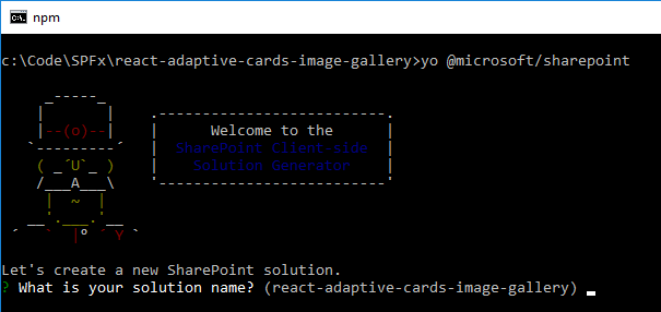
- Solution Name: Hit enter to have default name (react-adaptive-cards-image-gallery in this case) or type in any other name for your solution.
- Selected choice: Hit enter
- Target for component: Here we can select the target environment where we are planning to deploy the client webpart i.e. SharePoint Online or SharePoint OnPremise (SharePoint 2016 onwards).
- Selected choice: SharePoint Online only (latest)
- Place of files: We may choose to use the same folder or create a subfolder for our solution.
- Selected choice: Same folder
- Deployment option: Selecting Y will allow the app to deployed instantly to all sites and will be accessible everywhere.
- Selected choice: N (install on each site explicitly)
- Type of client-side component to create: We can choose to create client side webpart or an extension. Choose webpart option.
- Selected choice: WebPart
- Web part name: Hit enter to select the default name or type in any other name.
- Selected choice: AdaptiveCardsImageGallery
- Web part description: Hit enter to select the default description or type in any other value.
- Selected choice: Image Gallery implemented with Adaptive Cards
- Framework to use: Select any JavaScript framework to develop the component. Available choices are (No JavaScript Framework, React, and Knockout)
- Selected choice: React
- Solution Name: Hit enter to have default name (react-adaptive-cards-image-gallery in this case) or type in any other name for your solution.
- Yeoman generator will perform scaffolding process to generate the solution. The scaffolding process will take significant amount of time.
-
Once the scaffolding process is completed, lock down the version of project dependencies by running below command.
npm shrinkwrap -
On the command prompt type below command to open the solution in code editor of your choice.
code .
NPM Packages
adaptivecards (https://www.npmjs.com/package/adaptivecards)
On the command prompt, run below command to include the npm package.
npm install adaptivecards --save
SP PnP JS
On the command prompt, run the below command to install sp-pnp-js
npm install sp-pnp-js --save
SharePoint Information Architecture
A SharePoint list (named “Adaptive Card Images”) is provisioned to store the image information. The schema of the list is as below:
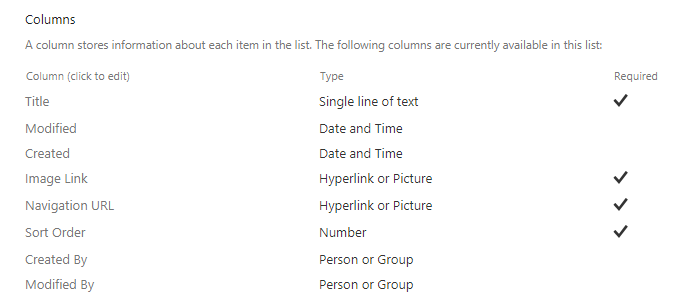
- The “Image Link” column stores the url of image to be displayed in adaptive card.
- The “Navigation URL” column represents the url to navigate by clicking on image in adaptive card.
- The “Sort Order” column represents the order in which images to be displayed in adaptive card.
Define State
Add file IAdaptiveCardsImageGalleryState.ts under “\src\webparts\adaptiveCardsImageGallery\components" folder.
export interface IAdaptiveCardsImageGalleryState {
    galleryItems: any[];
    isLoading: boolean;
    showErrorMessage: boolean;
}
Define Properties
Update IAdaptiveCardsImageGalleryProps.ts under “\src\webparts\adaptiveCardsImageGallery\components" folder as below:
import { ServiceScope } from '@microsoft/sp-core-library';

export interface IAdaptiveCardsImageGalleryProps {
  serviceScope: ServiceScope;
  imageGalleryName: string;
  imagesToDisplay: number;
}
Define Service
Define a service to retrieve information from SharePoint list.
import { ServiceKey, ServiceScope } from '@microsoft/sp-core-library';
import { PageContext } from '@microsoft/sp-page-context';
import { SPHttpClient, SPHttpClientResponse } from '@microsoft/sp-http';
import * as pnp from "sp-pnp-js";

export interface IImageGalleryService {
    getGalleryImages: (listName: string, rowLimit: number) => Promise<any[]>;
}

export class ImageGalleryService implements IImageGalleryService {
    public static readonly serviceKey: ServiceKey<IImageGalleryService> = ServiceKey.create<IImageGalleryService>('ImageGallery:ImageGalleryService', ImageGalleryService);
    private _pageContext: PageContext;

    constructor(serviceScope: ServiceScope) {
        serviceScope.whenFinished(() => {
            this._pageContext = serviceScope.consume(PageContext.serviceKey);
        });
    }

    public getGalleryImages(listName: string, rowLimit: number): Promise<any[]> {
        const xml = `<View>
                        <ViewFields>
                            <FieldRef Name='ID' />
                            <FieldRef Name='Title' />
                            <FieldRef Name='ImageLink' />
                            <FieldRef Name='NavigationURL' />
                        </ViewFields>
                        <Query>
                            <OrderBy>
                                <FieldRef Name='SortOrder' />
                            </OrderBy>
                        </Query>
                        <RowLimit>` + rowLimit + `</RowLimit>
                    </View>`;

        const q: any = {
            ViewXml: xml,
        };

        return this._ensureList(listName).then((list) => {
            if (list) {
                return pnp.sp.web.lists.getByTitle(listName).getItemsByCAMLQuery(q).then((items: any[]) => {
                    return Promise.resolve(items);
                });
            }
        });
    }

    private _ensureList(listName: string): Promise<pnp.List> {
        if (listName) {
            return pnp.sp.web.lists.ensure(listName).then((listEnsureResult) => Promise.resolve(listEnsureResult.list));
        }
    }
}
Code the WebPart
- Open main webpart AdaptiveCardsImageGallery.tsx under “\src\webparts\adaptiveCardsImageGallery\components".
-
Add below imports.
import * as React from 'react'; import styles from './AdaptiveCardsImageGallery.module.scss'; import { IAdaptiveCardsImageGalleryProps } from './IAdaptiveCardsImageGalleryProps'; import { IAdaptiveCardsImageGalleryState } from './IAdaptiveCardsImageGalleryState'; import { escape } from '@microsoft/sp-lodash-subset'; import * as AdaptiveCards from "adaptivecards"; import { ImageGalleryService, IImageGalleryService } from '../services/ImageGalleryService'; import { ServiceScope, Environment, EnvironmentType } from '@microsoft/sp-core-library'; import { Spinner, SpinnerSize } from 'office-ui-fabric-react/lib/Spinner'; -
Implement render method.
public render(): React.ReactElement<IAdaptiveCardsImageGalleryProps> { return ( <div className={styles.adaptiveCardsImageGallery}> <div className={styles.container}> {this.state.isLoading && <Spinner className={styles.spinner} size={SpinnerSize.large} />} {!this.state.isLoading && <div ref={(n) => { n && n.appendChild(this.renderedCard) }} />} </div> </div> ); } -
In the constructor, create an AdaptiveCard instance as below:
// Create an AdaptiveCard instance var adaptiveCard = new AdaptiveCards.AdaptiveCard(); // Set its hostConfig property unless you want to use the default Host Config // Host Config defines the style and behavior of a card adaptiveCard.hostConfig = new AdaptiveCards.HostConfig({ fontFamily: "Segoe UI, Helvetica Neue, sans-serif" }); // Set the adaptive card's event handlers. onExecuteAction is invoked // whenever an action is clicked in the card adaptiveCard.onExecuteAction = function(action) { window.location.href = action.iconUrl; }; // Parse the card adaptiveCard.parse(this.card); // Render the card to an HTML element this.renderedCard = adaptiveCard.render(); -
Define the card as below.
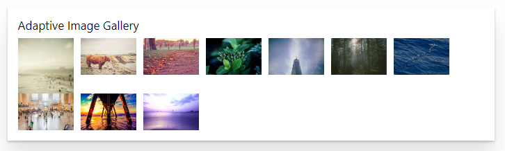
this.card = { "$schema": "http://adaptivecards.io/schemas/adaptive-card.json", "type": "AdaptiveCard", "version": "1.0", "body": [ { "type": "TextBlock", "text": "Adaptive Image Gallery", "size": "medium" }, { "type": "ImageSet", "imageSize": "medium", "images": this.imagesJSON } ] }; -
Get the data from service as below:
 let serviceScope: ServiceScope;
 serviceScope = this.props.serviceScope;

 // Based on the type of environment, return the correct instance of the ImageGalleryServiceInstance interface
 if (Environment.type == EnvironmentType.SharePoint || Environment.type == EnvironmentType.ClassicSharePoint) {
 // Mapping to be used when webpart runs in SharePoint.
 this.ImageGalleryServiceInstance = serviceScope.consume(ImageGalleryService.serviceKey);
 }

 this.ImageGalleryServiceInstance.getGalleryImages(this._galleryListName, this._noOfItems).then((galleryImages: any[]) => {
 galleryImages.forEach(adaptiveImage => {
     let image = {};
     image["type"] = "Image";
     image["url"] = adaptiveImage.ImageLink.Url;

     // Compose image action
     let imageAction = {};
     imageAction["title"] = adaptiveImage.NavigationURL.Description;
     imageAction["type"] = "Action.OpenUrl";
     imageAction["url"] = adaptiveImage.NavigationURL.Url;
     imageAction["iconUrl"] = adaptiveImage.NavigationURL.Url;

     image["selectAction"] = imageAction;
     this.imagesJSON.push(image);
 });
Run the SPFx WebPart
- On the command prompt, type
gulp serve. - Open SharePoint site.
- Navigate to /_layouts/15/workbench.aspx
-
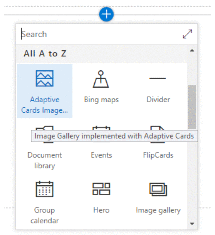
Add the webpart to page.
-
Edit the web part and update Image Gallery and Number of images to display properties
Summary
Adaptive Cards are new way for the developers to exchange card content in common and consistent way. This example demonstrates the capability of using Adaptive Cards (https://adaptivecards.io/) with SharePoint Framework.
This content was originally posted here.


Leave a comment