Share Common CSS between multiple SPFx Web Parts

Overview
A SharePoint Framework (SPFx) solution may contain multiple web parts. In real-world scenarios, it does include numerous web parts and extensions. In most cases, we need to apply a common look and feel to all of these components.
In this article, we will explore how to share a CSS between multiple SPFx components (e.g. web parts and extensions).
Need for a common CSS
As we develop the SPFx web part (I am taking an example of the React-based web part), we keep adding multiple React components to it each handling a specific business component. Each component has got its own SCSS to apply styling to the component.
As we place SPFx components on the SharePoint page, they should have a common look and feel. E.g., a boxed border for all web parts, a web part heading, and text with a certain font, size, and color, etc. To render these common requirements, we should have a common CSS that can be shared by all React components and other web parts (and their React components) as well.
Common Development Approaches
I have seen a common practice by various developers to write a common CSS (for e.g. common.css file) and upload it to Style library of SharePoint site.
.ms-Grid {
    box-sizing: border-box;
    padding: 0 5px;
}

.ms-Grid-row {
  background: #c5c5c5;
}

.ms-Grid-col {
  padding-left: 15px;
  padding-right: 15px;
}
This common.css file is then injected on each SharePoint site using SPFx extension application customizer using SPComponentLoader.loadCss something like below:
protected onInit(): Promise<void> {
    SPComponentLoader.loadCss('/site assets/common.css');
    return super.onInit();
}
The SPFx web part component can then assume the existence of above pre-loaded CSS and use the css classes as below:
public render(): React.ReactElement<IClient360ProfileProps> {
    return (
        <div className="ms-Grid">
              <div className="ms-Grid-row">
                <div className="ms-Grid-col ">
                    <span>Hello World!</span>
                </div>
             </div>
        </div>
    );
}
Note: I will not argue here if it is the correct approach and I will leave it up to individuals by respecting their approach.
The Shared CSS way
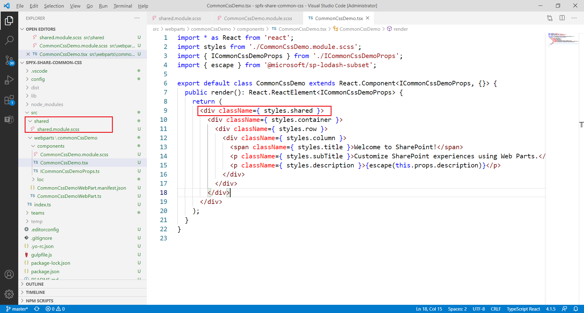
We can have a folder named Shared and a file shared.module.scss inside it.
@import "~office-ui-fabric-react/dist/sass/References.scss";

.shared {
    .container {
        box-sizing: border-box;
        padding: 0 5px;
        box-shadow: 0 2px 4px 0 rgba(0, 0, 0, 0.2), 0 25px 50px 0 rgba(0, 0, 0, 0.1);
    }

    .row {
        background: #f8f9fc;
    }

    .column {
        padding-left: 15px;
        padding-right: 15px;
    }
}
Update the web part css to use the Shared css. (For e.g., src\webparts\commonCssDemo\components\CommonCssDemo.module.scss)
@import "../../../shared/shared.module.scss";
Update the web part’s render method to use the shared css class.
public render(): React.ReactElement<ICommonCssDemoProps> {
    return (
      <div className={styles.shared}>
        <div className={styles.container}>
          <div className={styles.row}>
            <div className={styles.column}>
              <span className={styles.title}>Welcome to SharePoint!</span>
              <p className={styles.subTitle}>Customize SharePoint experiences using Web Parts.</p>
              <p className={styles.description}>{escape(this.props.description)}</p>
            </div>
          </div>
        </div>
      </div>
    );
}
This shared CSS can be used by all components in the SPFx solution.

Advantages of Shared CSS
Below are the advantages of using shared CSS:
- All CSS can be controlled at a centralized location
- Lesser maintenance
- Individual web part/component does not need a CSS update
Summary
A SharePoint Framework (SPFx) solution may contain multiple web parts. They should have a common look and feel when placed on a page. We explored multiple ways of achieving this in SPFx.
Code Download
The SPFx code developed for this article can be found here.


Leave a comment