
PnP Taxonomy Picker Control for SPFx
Overview
PnP has provided a Taxonomy picker control, which can be used to select one or more terms from a TermSet by its name or ID. This control is useful to be used in SPFx web part to allow users for managed metadata selection. Taxonomy Picker control offers various configuration options to support most of the business needs.
During this article, we will explore the Taxonomy Picker control from PnP on how to use, configure it in SPFx web part. We will develop a practical scenario to capture the managed metadata information in SPFx web part using PnP Taxonomy Picker Control and store it in SharePoint list.
Develop SharePoint Framework Web Part
-
Open a command prompt. Create a directory for SPFx solution.
md spfx-pnp-taxonomy-picker -
Navigate to the above created directory.
cd spfx-pnp-taxonomy-picker -
Run the Yeoman SharePoint Generator to create the solution.
yo @microsoft/sharepoint -
Yeoman generator will present you with the wizard by asking questions about the solution to be created.
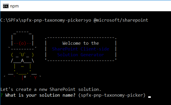
- Solution Name: Hit enter to have default name (spfx-pnp-taxonomy-picker in this case) or type in any other name for your solution.
- Selected choice: Hit enter
- Target for the component: Here we can select the target environment where we are planning to deploy the client web part i.e. SharePoint Online or SharePoint On-Premises (SharePoint 2016 onwards).
- Selected choice: SharePoint Online only (latest)
- Place of files: We may choose to use the same folder or create a sub-folder for our solution.
- Selected choice: Same folder
- Deployment option: Selecting Y will allow the app to deployed instantly to all sites and will be accessible everywhere.
- Selected choice: N (install on each site explicitly)
- Permissions to access web APIs: Choose if the components in the solution require permissions to access web APIs that are unique and not shared with other components in the tenant.
- Selected choice: N (solution contains unique permissions)
- Type of client-side component to create: We can choose to create client side web part or an extension. Choose web part option.
- Selected choice: WebPart
- Web part name: Hit enter to select the default name or type in any other name.
- Selected choice: PnPTaxonomyPicker
- Web part description: Hit enter to select the default description or type in any other value.
- Selected choice: Use PnP Taxonomy Picker control in SPFx solution
- Framework to use: Select any JavaScript framework to develop the component. Available choices are (No JavaScript Framework, React, and Knockout)
- Selected choice: React
- Solution Name: Hit enter to have default name (spfx-pnp-taxonomy-picker in this case) or type in any other name for your solution.
- Yeoman generator will perform scaffolding process to generate the solution. The scaffolding process will take a significant amount of time.
-
Once the scaffolding process is completed, lock down the version of project dependencies by running below command.
npm shrinkwrap -
On the command prompt type below command to open the solution in the code editor of your choice.
code .
NPM Packages Used
@pnp/spfx-controls-react (https://sharepoint.github.io/sp-dev-fx-controls-react/)
On the command prompt, run below command to include the npm package.
npm install @pnp/spfx-controls-react --save
@pnp/sp (https://www.npmjs.com/package/@pnp/sp)
On the command prompt, run below command.
npm i @pnp/logging @pnp/common @pnp/odata @pnp/sp --save
Pass the context from web part to React Component
As we need the SharePoint context to work with Taxonomy picker, we will have to pass it from our web part to the React component.
-
On the command prompt type below command to open the solution in the code editor of your choice.
code . - Open React component properties at “src\webparts\pnPTaxonomyPicker\components\IPnPTaxonomyPickerProps.ts”
-
Add below properties.
import { WebPartContext } from '@microsoft/sp-webpart-base'; export interface IPnPTaxonomyPickerProps { description: string; context: WebPartContext; } - From our web part (src\webparts\pnPTaxonomyPicker\PnPTaxonomyPickerWebPart.ts) pass the context to React component.
export default class PnPTaxonomyPickerWebPart extends BaseClientSideWebPart<IPnPTaxonomyPickerWebPartProps> {

  public render(): void {
    const element: React.ReactElement<IPnPTaxonomyPickerWebPartProps> = React.createElement(
      PnPTaxonomyPicker,
      {
        description: this.properties.description,
        context: this.context
      }
    );

    ReactDom.render(element, this.domElement);
  }
  .
  .
  .
}
Code the Web Part
- Open the React component file at “src\webparts\pnPTaxonomyPicker\components\PnPTaxonomyPicker.tsx”
-
Add below imports.
import { TaxonomyPicker, IPickerTerms } from "@pnp/spfx-controls-react/lib/TaxonomyPicker"; -
Use the TaxonomyPicker control in the render method as follows.
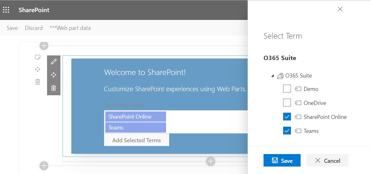
 export default class PnPTaxonomyPicker extends React.Component<IPnPTaxonomyPickerProps, {}> {
   public render(): React.ReactElement<IPnPTaxonomyPickerProps> {
     return (
       <div className={ styles.pnPTaxonomyPicker }>
         <div className={ styles.container }>
           <div className={ styles.row }>
             <div className={ styles.column }>
               <span className={ styles.title }>Welcome to SharePoint!</span>
               <p className={ styles.subTitle }>Customize SharePoint experiences using Web Parts.</p>

               <TaxonomyPicker allowMultipleSelections={true}
                 termsetNameOrID="Countries"
                 panelTitle="Select Term"
                 label="Taxonomy Picker"
                 context={this.props.context}
                 onChange={this.onTaxPickerChange}
                 isTermSetSelectable={false} />
             </div>
           </div>
         </div>
       </div>
     );
   }
 }
Specify the term set value for the termsetNameOrID property as the managed metadata selection.
- Implement onChange property to get the selected terms from the TaxonomyPicker.
private onTaxPickerChange(terms : IPickerTerms) {
  console.log("Terms", terms);
}
Define the State
Let us define the state to store the selected terms information.
Add file IPnPTaxonomyPickerState.ts under folder “\src\webparts\pnPTaxonomyPicker\components".
import { IPickerTerms } from "@pnp/spfx-controls-react/lib/TaxonomyPicker";

export interface IPnPTaxonomyPickerState {
    selectedTerms: IPickerTerms;
}
Update the React component “\src\webparts\pnPTaxonomyPicker\components\PnPTaxonomyPicker.tsx” to use the state.
import * as React from 'react';
import styles from './PnPTaxonomyPicker.module.scss';
import { IPnPTaxonomyPickerProps } from './IPnPTaxonomyPickerProps';
import { IPnPTaxonomyPickerState } from './IPnPTaxonomyPickerState';
import { escape } from '@microsoft/sp-lodash-subset';

// @pnp/sp imports
import { sp, Web } from '@pnp/sp';
import { getGUID } from "@pnp/common";

import { TaxonomyPicker, IPickerTerms } from "@pnp/spfx-controls-react/lib/TaxonomyPicker";

export default class PnPTaxonomyPicker extends React.Component<IPnPTaxonomyPickerProps, IPnPTaxonomyPickerState> {

  constructor(props: IPnPTaxonomyPickerProps, state: IPnPTaxonomyPickerState) {
    super(props);

    this.state = {
      selectedTerms: []
    };
  }
   .
   .
   .
}
Define the controls
Let us add a button control. On click of the button, we will add the selected terms from taxonomy picker to the SharePoint list.
- Open React component PnPTaxonomyPicker.tsx at folder “src\webparts\pnPTaxonomyPicker\components".
-
Add below import for button control.
// Import button component import { IButtonProps, DefaultButton } from 'office-ui-fabric-react/lib/Button'; import { autobind } from 'office-ui-fabric-react'; -
Define a button inside the render method.
<DefaultButton data-automation-id="addSelectedTerms" title="Add Selected Terms" onClick={this.addSelectedTerms}> Add Selected Terms </DefaultButton> - Implement the supporting methods as below.
@autobind
private onTaxPickerChange(terms : IPickerTerms) {
  console.log("Terms", terms);
  this.setState({ selectedTerms: terms });
}
Add Selected Terms to SharePoint List
We are adding the selected terns to React state using onTaxPickerChange method of TaxonomyPicker PnP control. Now, we will implement a logic to add the selected terms from React state to actual SharePoint list. We will define 2 managed metadata columns (single selection and multi-selection).
-
Add below imports.
// @pnp/sp imports import { sp } from '@pnp/sp'; import { getGUID } from "@pnp/common"; // Import button component import { DefaultButton } from 'office-ui-fabric-react/lib/Button'; import { autobind } from 'office-ui-fabric-react'; -
Add button insider Render method.
<DefaultButton data-automation-id="addSelectedTerms" title="Add Selected Terms" onClick={this.addSelectedTerms}> Add Selected Terms </DefaultButton> -
Implement addSelectedTerms method.
@autobind
private addSelectedTerms(): void {
  // Update single value managed metadata field, with first selected term
  sp.web.lists.getByTitle("SPFx Users").items.add({
    Title: getGUID(),
    FirstTerm: {
      __metadata: { "type": "SP.Taxonomy.TaxonomyFieldValue" },
      Label: this.state.selectedTerms[0].name,
      TermGuid: this.state.selectedTerms[0].key,
      WssId: -1
    }
  }).then(i => {
      console.log(i);
  });

  // Update multi value managed metadata field
  const spfxList = sp.web.lists.getByTitle('SPFx Users');

  // If the name of your taxonomy field is SomeMultiValueTaxonomyField, the name of your note field will be SomeMultiValueTaxonomyField_0
  const multiTermNoteFieldName = 'Terms_0';

  let termsString: string = '';
  this.state.selectedTerms.forEach(term => {
    termsString += `-1;#${term.name}|${term.key};#`;
  });

  spfxList.getListItemEntityTypeFullName()
    .then((entityTypeFullName) => {
      spfxList.fields.getByTitle(multiTermNoteFieldName).get()
        .then((taxNoteField) => {
          const multiTermNoteField = taxNoteField.InternalName;
          const updateObject = {
            Title: 'Item title',
          };
          updateObject[multiTermNoteField] = termsString;

          spfxList.items.add(updateObject, entityTypeFullName)
            .then((updateResult) => {
                console.dir(updateResult);
            })
            .catch((updateError) => {
                console.dir(updateError);
            });
        });
    });
}
Setup SharePoint List
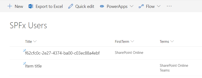
Setup SharePoint list (named “SPFx Users”) with below schema.
| Column | Type | Comments |
| Title | Single line of text | Out of box title column |
| FirstTerm | Managed Metadata | Set “Allow multiple values” to No |
| Terms | Managed Metadata | Set “Allow multiple values” to Yes |
Test the PnP Taxonomy Picker
- On the command prompt, type
gulp serve. - Open SharePoint site.
- Navigate to /_layouts/15/workbench.aspx
- Locate and add the webpart (named PnPTaxonomyPicker) to page.
- Select the terms using taxonomy picker.
-
Click “Add Selected Terms”.
- The selected terms should get added to the SharePoint list.
Summary
In this article, we explore the practical use of Taxonomy Picker control in SPFx web part. We configured the PnP Taxonomy Picker control to capture the information from the user and used PnP list item operation to add the information to SharePoint list.
References
This content was originally posted here.


Leave a comment