
SharePoint Framework – Build Custom Controls for Web Part Property Pane
Overview
SharePoint Framework web parts support various predefined typed objects (e.g. textbox, checkbox, link, slider, etc.) to define properties for our SPFx web part. These predefined typed objects are sufficient in most cases, however, to meet certain business scenarios, we have to go beyond and create our own custom controls. One classic example of this is list selection for the web part. We can have a simple textbox in web part property pane to allow the user to enter the SharePoint list name. However, listing all available SharePoint lists in a dropdown will give a more seamless experience to the end users.
In this article, we will build custom controls for property pane and develop list dropdown selection property pane.
Create SPFx Solution
-
Open command prompt. Create a directory for SPFx solution.
md spfx-customcontrol-propertypane -
Navigate to above created directory.
cd spfx-customcontrol-propertypane -
Run Yeoman SharePoint Generator to create the solution.
yo @microsoft/sharepoint -
Yeoman generator will present you with the wizard by asking questions about the solution to be created.
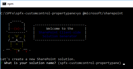
- Solution Name: Hit enter to have default name (spfx-customcontrol-propertypane in this case) or type in any other name for your solution.
- Selected choice: Hit enter
- Target for component: Here we can select the target environment where we are planning to deploy the client webpart i.e. SharePoint Online or SharePoint OnPremise (SharePoint 2016 or 2019 onwards).
- Selected choice: SharePoint Online only (latest)
- Place of files: We may choose to use the same folder or create a subfolder for our solution.
- Selected choice: Use the current folder
- Deployment option: Selecting Y will allow the app to deployed instantly to all sites and will be accessible everywhere.
- Selected choice: Y
- Permissions to access web APIs: Choose if the components in the solution require permissions to access web APIs that are unique and not shared with other components in the tenant.
- Selected choice: N (solution contains unique permissions)
- Type of client-side component to create: We can choose to create client side webpart or an extension.
- Selected choice: WebPart
- Web Part Name: Hit enter to select the default name or type in any other name.
- Selected choice: CustomPropertyPaneDemo
- Web part description: Hit enter to select the default description or type in any other value.
- Selected choice: Hit enter
- Framework to use: Select any JavaScript framework to develop the component. Available choices are (No JavaScript Framework, React, and Knockout)
- Selected choice: React
- Solution Name: Hit enter to have default name (spfx-customcontrol-propertypane in this case) or type in any other name for your solution.
-
Once the scaffolding is completed, lock down the version of project dependencies by running below command.
npm shrinkwrap -
On the command prompt, type below command to open the solution in code editor of your choice.
code .
Define Web Part Property
We are building a custom control to display the lists from current SharePoint site. We will define a web part property for storing the user selected list from web part property pane.
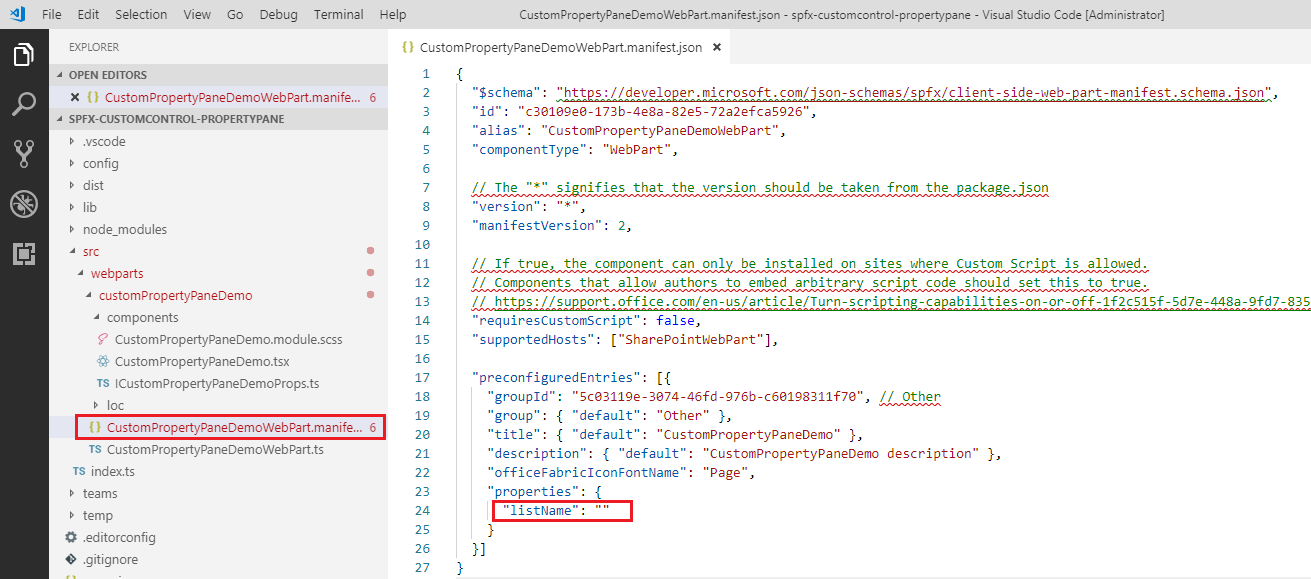
- Open CustomPropertyPaneDemoWebPart.manifest.json under “\src\webparts\customPropertyPaneDemo” folder.
-
Rename default description property to listName.
-
Open “src\webparts\customPropertyPaneDemo\components\ICustomPropertyPaneDemoProps.ts” and update it to use listName property.
export interface ICustomPropertyPaneDemoProps { listName: string; } -
In the “\src\webparts\customPropertyPaneDemo\CustomPropertyPaneDemoWebPart.ts”, update render method to use listName property.
public render(): void { const element: React.ReactElement<ICustomPropertyPaneDemoProps> = React.createElement( CustomPropertyPaneDemo, { listName: this.properties.listName } ); ReactDom.render(element, this.domElement); } -
Update getPropertyPaneConfiguration method.
protected getPropertyPaneConfiguration(): IPropertyPaneConfiguration { return { pages: [ { header: { description: strings.PropertyPaneDescription }, groups: [ { groupName: strings.BasicGroupName, groupFields: [ PropertyPaneTextField('listName', { label: strings.ListFieldLabel }) ] } ] } ] }; } -
Update the interface at “src\webparts\customPropertyPaneDemo\loc\mystrings.d.ts”.
declare interface ICustomPropertyPaneDemoWebPartStrings { PropertyPaneDescription: string; BasicGroupName: string; ListFieldLabel: string; } -
In the “src\webparts\customPropertyPaneDemo\loc\en-us.js”, update definition as below.
define([], function() { return { "PropertyPaneDescription": "Description", "BasicGroupName": "Group Name", "ListFieldLabel": "List" } }); -
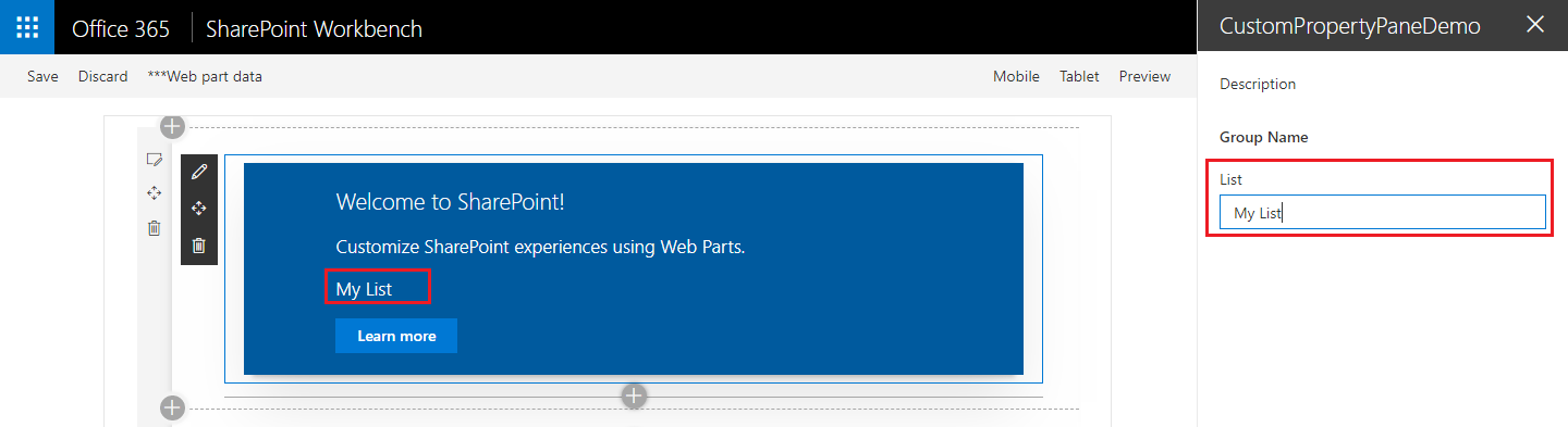
In the “src\webparts\customPropertyPaneDemo\components\CustomPropertyPaneDemo.tsx” update render method to use listName property field.
public render(): React.ReactElement<ICustomPropertyPaneDemoProps> { return ( <div className={ styles.customPropertyPaneDemo }> <div className={ styles.container }> <div className={ styles.row }> <div className={ styles.column }> <span className={ styles.title }>Welcome to SharePoint!</span> <p className={ styles.subTitle }>Customize SharePoint experiences using Web Parts.</p> <p className={ styles.description }>{escape(this.props.listName)}</p> <a href="https://aka.ms/spfx" className={ styles.button }> <span className={ styles.label }>Learn more</span> </a> </div> </div> </div> </div> ); } -
Update props at “src\webparts\customPropertyPaneDemo\components\ICustomPropertyPaneDemoProps.ts”.
export interface ICustomPropertyPaneDemoProps { listName: string; } - On the command prompt, type
gulp serveto see the new web part property in action.
Add Dropdown Property Pane Control
Let us implement a drop down for showing lists from SharePoint site.
Define React Props for dropdown
Under “src\webparts\customPropertyPaneDemo\components”, add a file IListDropdownProps.ts
import { IDropdownOption } from 'office-ui-fabric-react/lib/components/Dropdown';

export interface IListDropdownProps {
  label: string;
  loadOptions: () => Promise<IDropdownOption[]>;
  onChanged: (option: IDropdownOption, index?: number) => void;
  selectedKey: string | number;
  disabled: boolean;
  stateKey: string;
}
The above class defines properties for React component being used on web part property pane.
- label: specifies label for dropdown control.
- loadOptions: function associated with this delegate loads available options.
- onChanged: function associated with this delegate is called upon user selection.
- selectKey: specified selected value.
- disabled: specifies if dropdown is disabled or not.
- stateKey: forces React component to re-render.
Define React State for dropdown
Under “src\webparts\customPropertyPaneDemo\components”, add a file IListDropdownState.ts
import { IDropdownOption } from 'office-ui-fabric-react/lib/components/Dropdown';

export interface IListDropdownState {
  loading: boolean;
  options: IDropdownOption[];
  error: string;
}
The above interface defines state for React component.
- loading: defines if component is loading its options
- options: holds all available dropdown option.
- error: defines any error occurred.
Define DropDown React Component
Under “src\webparts\customPropertyPaneDemo\components”, add a file ListDropdown.tsx
import * as React from 'react';
import { Dropdown, IDropdownOption } from 'office-ui-fabric-react/lib/components/Dropdown';
import { Spinner } from 'office-ui-fabric-react/lib/components/Spinner';
import { IListDropdownProps } from './IListDropdownProps';
import { IListDropdownState } from './IListDropdownState';

export default class ListDropdown extends React.Component<IListDropdownProps, IListDropdownState> {
  private selectedKey: React.ReactText;

  constructor(props: IListDropdownProps, state: IListDropdownState) {
    super(props);
    this.selectedKey = props.selectedKey;

    this.state = {
      loading: false,
      options: undefined,
      error: undefined
    };
  }

  public componentDidMount(): void {
    this.loadOptions();
  }

  public componentDidUpdate(prevProps: IListDropdownProps, prevState: IListDropdownState): void {
    if (this.props.disabled !== prevProps.disabled ||
      this.props.stateKey !== prevProps.stateKey) {
      this.loadOptions();
    }
  }

  private loadOptions(): void {
    this.setState({
      loading: true,
      error: undefined,
      options: undefined
    });

    this.props.loadOptions()
      .then((options: IDropdownOption[]): void => {
        this.setState({
          loading: false,
          error: undefined,
          options: options
        });
      }, (error: any): void => {
        this.setState((prevState: IListDropdownState, props: IListDropdownProps): IListDropdownState => {
          prevState.loading = false;
          prevState.error = error;
          return prevState;
        });
      });
  }

  public render(): JSX.Element {
    const loading: JSX.Element = this.state.loading ? <div><Spinner label={'Loading options...'} /></div> : <div />;
    const error: JSX.Element = this.state.error !== undefined ? <div className={'ms-TextField-errorMessage ms-u-slideDownIn20'}>Error while loading items: {this.state.error}</div> : <div />;

    return (
      <div>
        <Dropdown label={this.props.label}
          disabled={this.props.disabled || this.state.loading || this.state.error !== undefined}
          onChanged={this.onChanged.bind(this)}
          selectedKey={this.selectedKey}
          options={this.state.options} />
        {loading}
        {error}
      </div>
    );
  }

  private onChanged(option: IDropdownOption, index?: number): void {
    this.selectedKey = option.key;
    // reset previously selected options
    const options: IDropdownOption[] = this.state.options;
    options.forEach((o: IDropdownOption): void => {
      if (o.key !== option.key) {
        o.selected = false;
      }
    });
    this.setState((prevState: IListDropdownState, props: IListDropdownProps): IListDropdownState => {
      prevState.options = options;
      return prevState;
    });
    if (this.props.onChanged) {
      this.props.onChanged(option, index);
    }
  }
}
ListDropdown class represents React component to render dropdown property pane control.
The component loads available options by calling loadOptions method. Once options are loaded, component state is updated to show the options. The dropdown is rendered using Office UI fabric React dropdown component.
Add List Dropdown to Property Pane Control
To define public properties for dropdown property pane control, add IPropertyPaneDropdownProps.ts file under “src\webparts\customPropertyPaneDemo\components” folder.
import { IDropdownOption } from 'office-ui-fabric-react/lib/components/Dropdown';

export interface IPropertyPaneDropdownProps {
  label: string;
  loadOptions: () => Promise<IDropdownOption[]>;
  onPropertyChange: (propertyPath: string, newValue: any) => void;
  selectedKey: string | number;
  disabled?: boolean;
}
In the above interface:
- label: specifies label for dropdown control.
- loadOptions: function associated with this delegate loads available options.
- onPropertyChang: function associated with this delegate is called upon user selection.
- selectKey: specified selected value.
- disabled: specifies if dropdown is disabled or not.
Define internal properties for dropdown property pane control
Create new file IPropertyPaneDropdownInternalProps.ts under “src\webparts\customPropertyPaneDemo\components" folder.
import { IPropertyPaneCustomFieldProps } from '@microsoft/sp-webpart-base';
import { IPropertyPaneDropdownProps } from './IPropertyPaneDropdownProps';

export interface IPropertyPaneDropdownInternalProps extends IPropertyPaneDropdownProps, IPropertyPaneCustomFieldProps {
}
This interface does not define any new properties, however it combines the properties from previously defined IPropertyPaneDropdownProps interface and standard SharePoint Framework IPropertyPaneCustomFieldProps interface for custom control to run correctly.
Define dropdown property pane control
Create new file “PropertyPaneDropdown.ts” under “src\webparts\customPropertyPaneDemo\components" folder.
import * as React from 'react';
import * as ReactDom from 'react-dom';
import {
  IPropertyPaneField,
  PropertyPaneFieldType
} from '@microsoft/sp-webpart-base';
import { IDropdownOption } from 'office-ui-fabric-react/lib/components/Dropdown';
import { IPropertyPaneDropdownProps } from './IPropertyPaneDropdownProps';
import { IPropertyPaneDropdownInternalProps } from './IPropertyPaneDropdownInternalProps';
import ListDropdown from './ListDropdown';
import { IListDropdownProps } from './IListDropdownProps';

export class PropertyPaneDropdown implements IPropertyPaneField<IPropertyPaneDropdownProps> {
  public type: PropertyPaneFieldType = PropertyPaneFieldType.Custom;
  public targetProperty: string;
  public properties: IPropertyPaneDropdownInternalProps;
  private elem: HTMLElement;

  constructor(targetProperty: string, properties: IPropertyPaneDropdownProps) {
    this.targetProperty = targetProperty;
    this.properties = {
      key: properties.label,
      label: properties.label,
      loadOptions: properties.loadOptions,
      onPropertyChange: properties.onPropertyChange,
      selectedKey: properties.selectedKey,
      disabled: properties.disabled,
      onRender: this.onRender.bind(this)
    };
  }

  public render(): void {
    if (!this.elem) {
      return;
    }

    this.onRender(this.elem);
  }

  private onRender(elem: HTMLElement): void {
    if (!this.elem) {
      this.elem = elem;
    }

    const element: React.ReactElement<IListDropdownProps> = React.createElement(ListDropdown, {
      label: this.properties.label,
      loadOptions: this.properties.loadOptions,
      onChanged: this.onChanged.bind(this),
      selectedKey: this.properties.selectedKey,
      disabled: this.properties.disabled,
      // required to allow the component to be re-rendered by calling this.render() externally
      stateKey: new Date().toString()
    });
    ReactDom.render(element, elem);
  }

  private onChanged(option: IDropdownOption, index?: number): void {
    this.properties.onPropertyChange(this.targetProperty, option.key);
  }
}
The above class implements standard SharePoint Framework IPropertyPaneField interface.
Use Dropdown Property Pane Control in Web Part
Add list information interface
Define an interface that represents SharePoint list.
Create a new file IListInfo.ts under “src\webparts\customPropertyPaneDemo” folder.
export interface IListInfo {
    Id: string;
    Title: string;
}
Reference Dropdown Property Pane in Web Part
In the webpart file “src\webparts\customPropertyPaneDemo\CustomPropertyPaneDemoWebPart.ts”, import PropertyPaneDropdown class.
import { PropertyPaneDropdown } from './components/PropertyPaneDropdown';
Add reference to interface and helper functions to work with web part properties.
import { IDropdownOption } from 'office-ui-fabric-react/lib/components/Dropdown';
import { update, get } from '@microsoft/sp-lodash-subset';
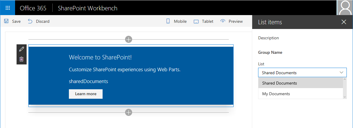
Add method to load available lists. For the sake of simplicity, we are using mock data here.
private loadLists(): Promise<IDropdownOption[]> {
  return new Promise<IDropdownOption[]>((resolve: (options: IDropdownOption[]) => void, reject: (error: any) => void) => {
    setTimeout(() => {
      resolve([{
        key: 'sharedDocuments',
        text: 'Shared Documents'
      },
        {
          key: 'myDocuments',
          text: 'My Documents'
        }]);
    }, 2000);
  });
}
Add method to handle property dropdown value change.
private onListChange(propertyPath: string, newValue: any): void {
  const oldValue: any = get(this.properties, propertyPath);
  // store new value in web part properties
  update(this.properties, propertyPath, (): any => { return newValue; });
  // refresh web part
  this.render();
}
Update getPropertyPaneConfiguration method to use dropdown property pane control to render the listName web part property.
protected getPropertyPaneConfiguration(): IPropertyPaneConfiguration {
  return {
    pages: [
      {
        header: {
          description: strings.PropertyPaneDescription
        },
        groups: [
          {
            groupName: strings.BasicGroupName,
            groupFields: [
              new PropertyPaneDropdown('listName', {
                label: strings.ListFieldLabel,
                loadOptions: this.loadLists.bind(this),
                onPropertyChange: this.onListChange.bind(this),
                selectedKey: this.properties.listName
              })
            ]
          }
        ]
      }
    ]
  };
}
Test the Custom Property Pane
On the command prompt, type gulp serve. Add the webpart and verify the property pane.
Summary
In this article, we explored how to build custom control for SPFx web part property pane. Predefined typed objects are sufficient in most cases, however, to meet certain business scenarios, we have to go beyond and create our own custom controls. The process to develop custom controls is a bit tedious to make it work.
This content was originally posted here.


Leave a comment