
PnP Property Pane Controls for SharePoint Framework
Overview
Microsoft has provided various property pane controls for SharePoint Framework web parts. If our business needs demands, we can create our own custom property pane controls. However developing custom property pane controls is bit tedious, time consuming task. The amount of code that goes in for developing custom property pane controls is many a times equals amount of code being written for the actual web part. However it also increases maintenance burden. The code reusability in case of custom property pane controls is limited to copying the needed files across SPFx solutions and correcting the references. PnP (Patterns and Practices) has released a set of reusable property pane controls.
In this article, we will explore various property pane controls offered by PnP, install and start using them in our solution.
PnP Reusable Property Pane Controls
PnP (Office 365 Patterns and Practices) have released set of reusable property pane controls that can be used in SPFx solutions. Below are few of commonly used controls offered from PnP:
- Color picker
- Date and time selector
- List selector
- People / group selector
- Spin button
- Managed metadata term selector
- Multi-value selection
- Number values
- Information panel
In this example, we are going to use list selector property pane control in our SPFx web part.
Create SPFx Solution
-
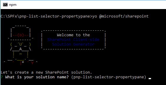
Open command prompt. Create a directory for SPFx solution.
md pnp-list-selector-propertypane -
Navigate to above created directory.
cd pnp-list-selector-propertypane -
Run Yeoman SharePoint Generator to create the solution.
yo @microsoft/sharepoint -
Yeoman generator will present you with the wizard by asking questions about the solution to be created.
- Solution Name: Hit enter to have default name (pnp-list-selector-propertypane in this case) or type in any other name for your solution.
- Selected choice: Hit enter
- Target for component: Here we can select the target environment where we are planning to deploy the client webpart i.e. SharePoint Online or SharePoint OnPremise (SharePoint 2016 or 2019 onwards).
- Selected choice: SharePoint Online only (latest)
- Place of files: We may choose to use the same folder or create a subfolder for our solution.
- Selected choice: Use the current folder
- Deployment option: Selecting Y will allow the app to deployed instantly to all sites and will be accessible everywhere.
- Selected choice: Y
- Permissions to access web APIs: Choose if the components in the solution require permissions to access web APIs that are unique and not shared with other components in the tenant.
- Selected choice: N (solution contains unique permissions)
- Type of client-side component to create: We can choose to create client side webpart or an extension.
- Selected choice: WebPart, since single part app pages are web parts.
- Web Part Name: Hit enter to select the default name or type in any other name.
- Selected choice: ListSelector
- Web part description: Hit enter to select the default description or type in any other value.
- Selected choice: Hit enter
- Framework to use: Select any JavaScript framework to develop the component. Available choices are (No JavaScript Framework, React, and Knockout)
- Selected choice: No JavaScript Framework
- Solution Name: Hit enter to have default name (pnp-list-selector-propertypane in this case) or type in any other name for your solution.
- Yeoman generator will perform scaffolding process to generate the solution. The scaffolding process will take significant amount of time.
-
Once the scaffolding process is completed, install PnP property pane controls dependency by running below command.
npm install @pnp/spfx-property-controls --save --save-exact -
Lock down the version of project dependencies by running below command.
npm shrinkwrap -
On the command prompt type below command to open the solution in code editor of your choice.
code .
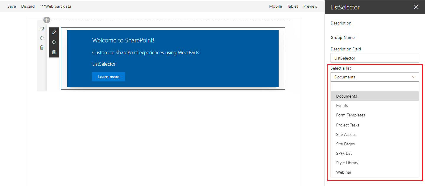
Use List Picker Control in Web Part
In order to use list picker property pane in SPFx webpart, follow below guidelines:
- Open web part file “src\webparts\listSelector\ListSelectorWebPart.ts”.
-
Import below modules.
import { PropertyFieldListPicker, PropertyFieldListPickerOrderBy } from '@pnp/spfx-property-controls/lib/PropertyFieldListPicker'; -
Create a new property for web part.
export interface IListSelectorWebPartProps { description: string; lists: string | string[]; // Stores the list ID(s) } -
Add custom property control to groupFields of web part property pane configuration.
 protected getPropertyPaneConfiguration(): IPropertyPaneConfiguration {
   return {
     pages: [
       {
         header: {
           description: strings.PropertyPaneDescription
         },
         groups: [
           {
             groupName: strings.BasicGroupName,
             groupFields: [
               PropertyPaneTextField('description', {
                 label: strings.DescriptionFieldLabel
               }),
               PropertyFieldListPicker('lists', {
                 label: 'Select a list',
                 selectedList: this.properties.lists,
                 includeHidden: false,
                 orderBy: PropertyFieldListPickerOrderBy.Title,
                 disabled: false,
                 onPropertyChange: this.onPropertyPaneFieldChanged.bind(this),
                 properties: this.properties,
                 context: this.context,
                 onGetErrorMessage: null,
                 deferredValidationTime: 0,
                 key: 'listPickerFieldId'
               })
             ]
           }
         ]
       }
     ]
   };
 }
Test the Web Part
- On the command prompt, type
gulp serve. - Open SharePoint site.
- Navigate to /_layouts/15/workbench.aspx
- Add the webpart to page.
- Edit the property pane.
Summary
Reusable PnP controls are available as npm packages which can be easily added to an SPFx solution. It helps to make the code look simple and easy to maintain.
This content was originally posted here.


Leave a comment