Implement Expand Collapse in SPFx with JavaScript

Overview
Expand / collapse (aka Accordion) is a very common requirement in SPFx web parts. There are various npm packages available for implementing this.
In this article, we will explore implementing expand / collapse functionality in SPFx using plain JavaScript. Although the implementation is with plain JavaScript, it can also be used with React based implementation.
Develop SPFx Solution
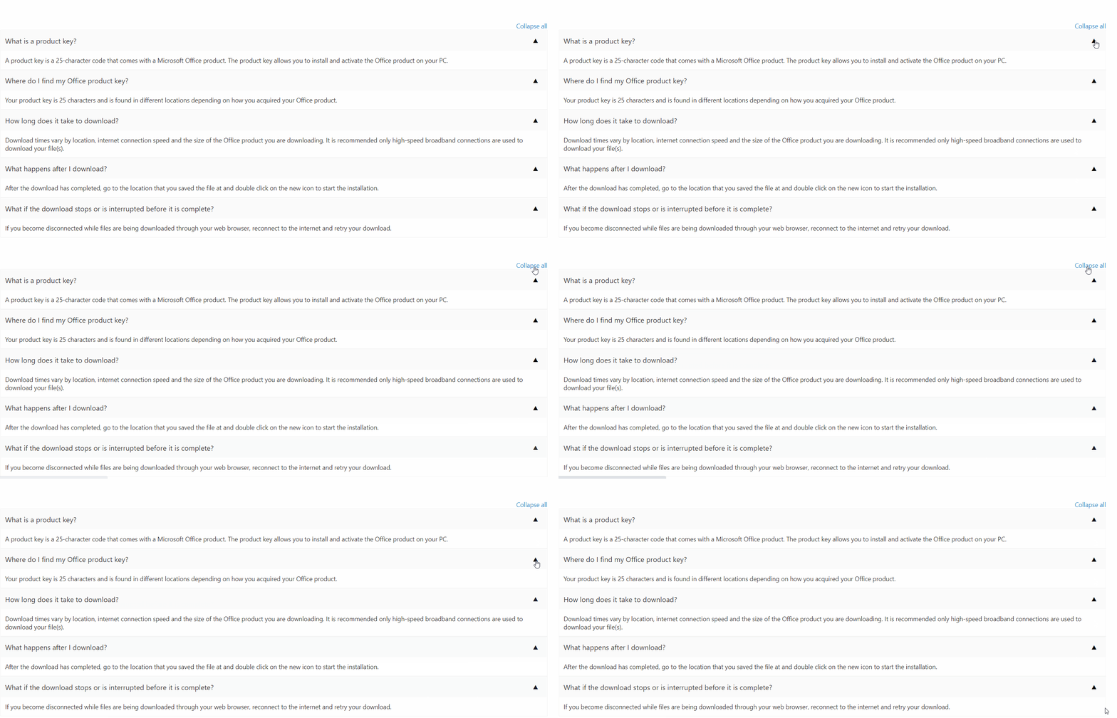
We will develop the SPFx web part as shown below:

In the solution, create a model at src\webparts\expandCollapse\IAnnouncementItem.ts to represent an Announcement item.
export interface IAnnouncementItem {
    title: string;
    description: string;
}
In the web part, implement method to read announcements. For simplicity, I am using mock method to return dummy announcements.
public getAnnouncementItems(): IAnnouncementItem[] {
    const announcementItems: IAnnouncementItem[] = [
      { title: "What is a product key?", description: "A product key is a 25-character code that comes with a Microsoft Office product. The product key allows you to install and activate the Office product on your PC." },
      { title: "Where do I find my Office product key?", description: "Your product key is 25 characters and is found in different locations depending on how you acquired your Office product." },
      { title: "How long does it take to download?", description: "Download times vary by location, internet connection speed and the size of the Office product you are downloading. It is recommended only high-speed broadband connections are used to download your file(s)." },
      { title: "What happens after I download?", description: "After the download has completed, go to the location that you saved the file at and double click on the new icon to start the installation." },
      { title: "What if the download stops or is interrupted before it is complete?", description: "If you become disconnected while files are being downloaded through your web browser, reconnect to the internet and retry your download." }
    ];

    return announcementItems;
}
The above FAQs are taken from Microsoft Frequently Asked Questions page
Update the render method to display the announcements.
public render(): void {
    this.enableExpandCollapse();

    this.domElement.innerHTML = `
      <div class="${styles.expandCollapse}">
        <div class="${styles.container}">
          <div class="${styles.row}">
            <div class="${styles.justifyContentEnd}">
              <a href="#" id="linkExpandAll" style="display: none" rel="noreferrer" onClick="${() => { this.expandAll(); }}">Expand all</a>
              <a href="#" id="linkCollapseAll" rel="noreferrer" onClick="${() => { this.collapseAll(); }}">Collapse all</a>
            </div>

            <div id="tblAnnouncementDetails">
            </div>

          </div>
        </div>
      </div>`;

    this.getAnnouncementDetails();
    this._setButtonEventHandlers();
}
In the enableExpandCollapse method, we use setInterval to evaluate the existence of element with className collapsible, and add click event to an individual button to expand / collapse a specific div next to it.
private enableExpandCollapse() {
    const existCondition = setInterval(() => {
      if (document.getElementsByClassName("collapsible").length > 0) {
        const coll = document.getElementsByClassName("collapsible");

        for (let i = 0; i < coll.length; i++) {
          coll[i].addEventListener("click", function () {
            this.classList.toggle("active");
            const content = this.parentElement.nextElementSibling;
            if (content.style.display === "block" || content.style.display === "") {
              this.textContent = "▼";
              content.style.display = "none";
            } else {
              this.textContent = "▲";
              content.style.display = "block";
            }
          });
        }
        clearInterval(existCondition);
      }
    }, 100);
}
The getAnnouncementDetails method will return the HTML structure for announcements to render.
private getAnnouncementDetails() {
    const announcementItems: IAnnouncementItem[] = this.getAnnouncementItems();

    let html: string = "<div>";

    announcementItems.forEach((item: IAnnouncementItem) => {
      html += `
      <div class="${styles.announcementItem}">
        <div class="${styles.titleRow}">
          <label>${item.title}</label>
          <button type="button" class="${styles.buttonExpandCollapse} collapsible"}>▲</button>
        </div>
        <div class="${styles.descriptionRow}">
          <label>${item.description}</label>
        </div>
      </div>`;
    });

    html += '</div>';

    const announcementContainer: Element = this.domElement.querySelector('#tblAnnouncementDetails');
    announcementContainer.innerHTML = html;
}
The _setButtonEventHandlers method will register the event handlers for Expand / collapse buttons:
private _setButtonEventHandlers(): void {
    const webPart: ExpandCollapseWebPart = this;

    this.domElement.querySelector('#linkExpandAll').addEventListener('click', () => { webPart.expandAll(); });
    this.domElement.querySelector('#linkCollapseAll').addEventListener('click', () => { webPart.collapseAll(); });
}
In the expandAll method, we are expanding all the divs using css style of display block, as clicked.
private expandAll() {
    if (document.getElementsByClassName("collapsible").length > 0) {
      const coll = document.getElementsByClassName("collapsible");

      for (let i = 0; i < coll.length; i++) {
        const content: any = coll[i].parentElement.nextElementSibling;
        coll[i].textContent = "▲";
        content.style.display = "block";
      }
    }

    const linkCollapseAll = document.getElementById("linkCollapseAll");
    const linkExpandAll = document.getElementById("linkExpandAll");
    if (typeof linkCollapseAll !== "undefined" && typeof linkExpandAll !== "undefined") {
      linkCollapseAll.style.display = "block";
      linkExpandAll.style.display = "none";
    }
}
In the collapseAll method, we are collapsing all the divs using css style of display none, as clicked.
private collapseAll() {
    if (document.getElementsByClassName("collapsible").length > 0) {
      const coll = document.getElementsByClassName("collapsible");

      for (let i = 0; i < coll.length; i++) {
        const content: any = coll[i].parentElement.nextElementSibling;
        coll[i].textContent = "▼";
        content.style.display = "none";
      }
    }

    const linkCollapseAll = document.getElementById("linkCollapseAll");
    const linkExpandAll = document.getElementById("linkExpandAll");
    if (typeof linkCollapseAll !== "undefined" && typeof linkExpandAll !== "undefined") {
      linkCollapseAll.style.display = "none";
      linkExpandAll.style.display = "block";
    }
}
The End Result
When deployed, the web part works as below:

Summary
A common requirement of expand / collapse (Accordion) functionality can be implemented using plain JavaScript in SPFx. As well, there are various third party npm packages available for this functionality.
Code Download
The SPFx code developed for this article can be found here.


Leave a comment