
SharePoint Framework: Handling Multiple Checkbox Selections in Fluent UI
Overview
The Checkbox allows the end user to select one or more options from the list of choices. The Fluent UI (aka Office UI Fabric) controls offers nice and simple implementation for Checkbox. The Checkbox, when clicked fires the “onChange” event.
In this article, we will explore how to use the Fluent UI Checkbox, dynamically create group of checkboxes, and handle selection event for multiple checkboxes.
Use Checkbox in SPFx Solution
Once you have SPFx solution created with React, you can take advantage of using Fluent UI controls.
-
Include Checkbox control in the solution by adding below imports:
import { Checkbox} from 'office-ui-fabric-react/lib/Checkbox'; -
Use Checkbox control inside render method.
<Checkbox label="Choices" onChange={_onChange} /> -
The onChange callback is called when the Checkbox’s checked value has been changed.
function _onChange(ev: React.FormEvent<HTMLElement>, isChecked: boolean) {
  console.log("The option has been changed to ${isChecked}.");
}
Now, when we change the value of Checkbox (checked / unchecked), it raises the onChange event which help detect the changed value. We can have multiple checkboxes like this with each one implementing its own onChange event.
Creating Dynamic Checkboxes
In many situations, we will have to dynamically create Checkboxes based on some business logic or data from a SharePoint list.
Let us define an interface to represent the data to bind to Checkbox.
const options: ICheckboxInput[] = [
  { ID: 1, Title: 'Apple' },
  { ID: 2, Title: 'Banana' },
  { ID: 3, Title: 'Fig' },
  { ID: 4, Title: 'Grape' },
  { ID: 5, Title: 'Kiwi' },
  { ID: 6, Title: 'Melon' },
  { ID: 7, Title: 'Orange' },
  { ID: 8, Title: 'Pineapple' }
];
Now, initialize some dummy data to bind to Checkbox. In real world scenario, this data will come from SharePoint list.
Now, inside render method, we will use this data to create Checkbox dynamically.
options.map((checkBoxItem: ICheckboxInput) => {
  return (
      <Checkbox label={checkBoxItem.Title} title={checkBoxItem.Title} onChange={this._onChange} />
  );
});
The dynamic Checkbox control is displayed as below:
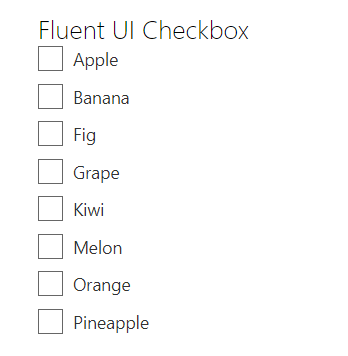
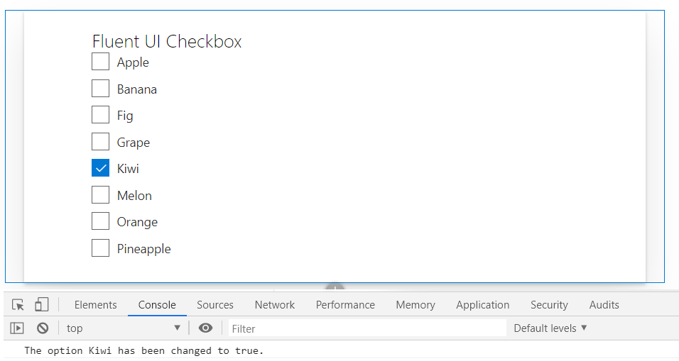
However, now it is bit difficult to find out which Checkbox is selected / unselected.
Solution
The React.FormEvent parameter of onChange event presents the information about the Checkbox control checked / unchecked. The “currentTarget” property is useful in this case.
Update the onChange event as below:
private _onChange(ev: React.FormEvent<HTMLInputElement>, isChecked: boolean) {
  console.log(`The option ${ev.currentTarget.title} has been changed to ${isChecked}.\`);
}
Since we have set the “title” property on our Checkbox, we are able to retrieve it from currentTarget. This helps to detect the Checkbox in action.
Summary
The Fluent UI (aka Office UI Fabric) controls offers nice and simple implementation for Checkbox. When we dynamically create Checkbox collection, it is bit tricky to get the selection. The property set on Checkbox during the control creation can be retrieved from currentTarget.
Code download
The code developed during this article can be found here:
https://github.com/nanddeepn/code-samples/tree/master/SPFx/WebParts/spfx-react-checkbox-control


Leave a comment