
PnP ListPicker Control for SPFx
Overview
Many of the times, the SharePoint web part requires to show information from the SharePoint site. One good example of it is available SharePoint lists in site. PnP (Patterns and Practices) offers ListPicker control allows selecting one or multiple available lists/libraries from the current SharePoint site.
During this article, we will explore the ListPicker control from PnP on how to use, configure it in the SPFx web part. We will develop a practical scenario to integrate ListPicker control in SPFx web part.
Develop SharePoint Framework Web Part
-
Open a command prompt. Create a directory for the SPFx solution.
md spfx-pnp-listpicker -
Navigate to the above created directory.
cd spfx-pnp-listpicker -
Run the Yeoman SharePoint Generator to create the solution.
yo @microsoft/sharepoint -
Yeoman generator will present you with the wizard by asking questions about the solution to be created.
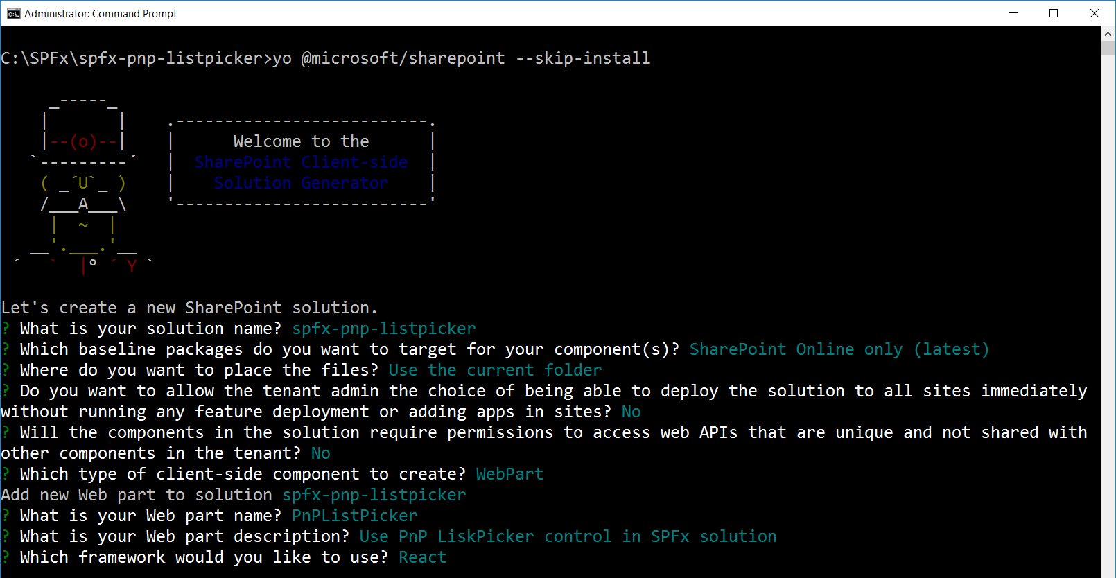
- Solution Name: Hit enter to have default name (spfx-pnp-listpicker in this case) or type in any other name for your solution.
- Selected choice: Hit enter
- Target for the component: Here we can select the target environment where we are planning to deploy the client web part i.e. SharePoint Online or SharePoint On-Premises (SharePoint 2016 onwards).
- Selected choice: SharePoint Online only (latest)
- Place of files: We may choose to use the same folder or create a sub-folder for our solution.
- Selected choice: Same folder
- Deployment option: Selecting Y will allow the app to deployed instantly to all sites and will be accessible everywhere.
- Selected choice: N (install on each site explicitly)
- Permissions to access web APIs: Choose if the components in the solution require permission to access web APIs that are unique and not shared with other components in the tenant.
- Selected choice: N (solution contains unique permissions)
- Type of client-side component to create: We can choose to create a client side web part or an extension. Choose web part option.
- Selected choice: WebPart
- Web part name: Hit enter to select the default name or type in any other name.
- Selected choice: PnPListPicker
- Web part description: Hit enter to select the default description or type in any other value.
- Selected choice: Use PnP LiskPicker control in SPFx solution
- Framework to use: Select any JavaScript framework to develop the component. Available choices are (No JavaScript Framework, React, and Knockout)
- Selected choice: React
- Solution Name: Hit enter to have default name (spfx-pnp-listpicker in this case) or type in any other name for your solution.
- Yeoman generator will perform the scaffolding process to generate the solution. The scaffolding process will take a significant amount of time.
-
Once the scaffolding process is completed, lock down the version of the project dependencies by running below command.
npm shrinkwrap - On the command prompt type below command to open the solution in the code editor of your choice.
code .
NPM Packages Dependency
@pnp/spfx-controls-react (https://sharepoint.github.io/sp-dev-fx-controls-react/)
SharePoint Framework React controls is an open source library that offers reusable set of React controls to be used in SPFx solution.
On the command prompt, run below command to include the npm package.
npm install @pnp/spfx-controls-react --save
Pass the context from web part to React Component
We will have to pass the SharePoint context from our web part to the React component to be used in ListPicker control.
- Open React component properties at “src\webparts\pnPListPicker\components\IPnPListPickerProps.ts”
-
Add below properties.
import { WebPartContext } from '@microsoft/sp-webpart-base'; export interface IPnPListPickerProps { description: string; context: WebPartContext; } -
From our main web part class (src\webparts\pnPWebPartTitle\PnPWebPartTitleWebPart.ts) pass the context to React component.
 export default class PnPListPickerWebPart extends BaseClientSideWebPart<IPnPListPickerWebPartProps> {

   public render(): void {
     const element: React.ReactElement<IPnPListPickerProps > = React.createElement(
       PnPListPicker,
       {
         description: this.properties.description,
         context: this.context
       }
     );

     ReactDom.render(element, this.domElement);
   }
   .
   .
   .
 }
Use ListPicker Control in the SPFx Web Part
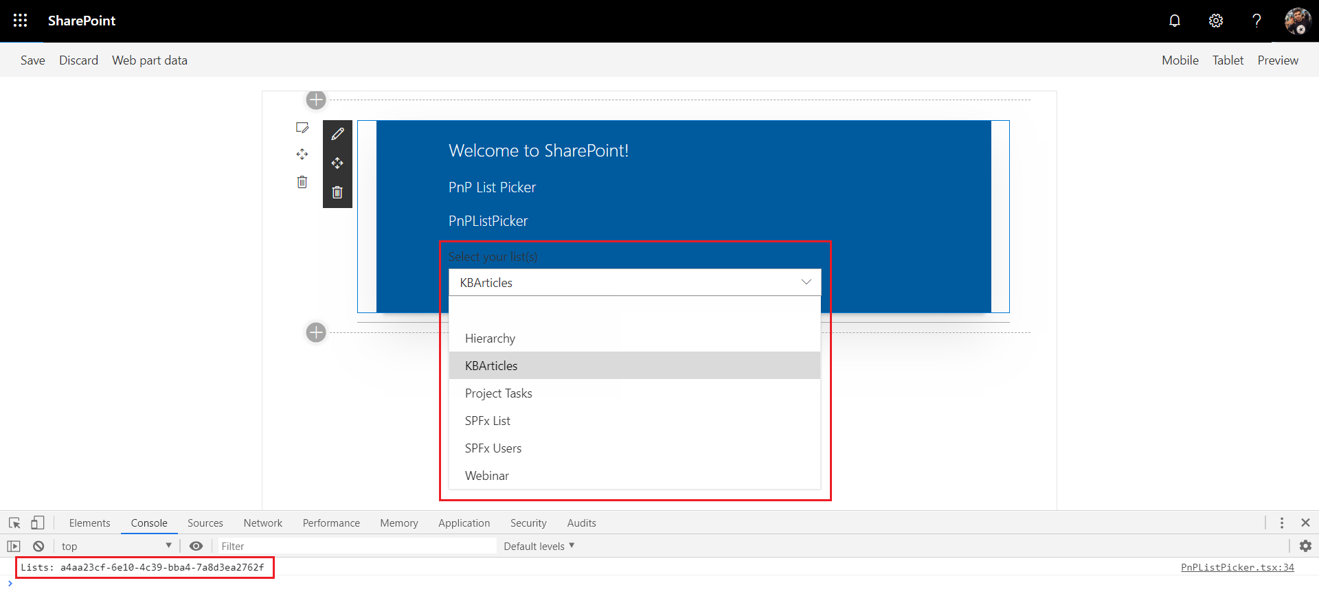
During the implementation, we will use ListPicker control to allow end users to select one or multiple available lists/libraries of the current site.
- Open the React component file at “src\webparts\pnPListPicker\components\PnPListPicker.tsx”
-
Add below imports.
import { ListPicker } from "@pnp/spfx-controls-react/lib/ListPicker"; -
Use the ListPicker control in the render method as follows.
 public render(): React.ReactElement<IPnPListPickerProps> {
   return (
     <div className={styles.pnPListPicker}>
       <div className={styles.container}>
         <div className={styles.row}>
           <div className={styles.column}>
             <span className={styles.title}>Welcome to SharePoint!</span>
             <p className={styles.subTitle}>PnP List Picker</p>
             <p className={styles.description}>PnP List Picker</p>

             <ListPicker context={this.props.context}
               label="Select your list(s)"
               placeHolder="Select your list(s)"
               baseTemplate={100}
               includeHidden={false}
               multiSelect={false}
               onSelectionChanged={this.onListPickerChange} />

           </div>
         </div>
       </div>
     </div>
   );
 }
Let us understand the ListPicker properties:
- context: The context of SPFx web part
- baseTemplate: SharePoint BaseTemplate ID to filter the list options
- includeHidden: Whether or not to include hidden lists.
- multiselect: Specify if multi-choice selection is allowed
- Implement the onSelectionChanged event which returns the list(s).
private onListPickerChange (lists: string | string[]) {
    console.log("Lists: ", lists);
}
Test the PnP WebPartTitle Control
- On the command prompt, type
gulp serve -nobrowser. - Open SharePoint site.
- Navigate to /_layouts/15/workbench.aspx
- Locate and add the web part (named PnPListPicker) to page.
The web part should display the SharePoint lists in a dropdown. Upon selection of the list from the dropdown, the list id will be logged to the browser console.
Summary
In this article, we explored the practical use of ListPicker control in the SPFx web part. The ListPicker control allows selecting one or multiple available lists/libraries from the current SharePoint site.
References
This content was originally posted here.


Leave a comment