Dynamically Load SPFx Library Components
Overview
Library components are generally available with SPFx v1.9.1 release. The library component helps to build independently versioned and deployed code. It then can be consumed by various SPFx web parts or extensions.
In this article, we will explore how to dynamically load the library component and the benefits of dynamic loading.
Why load the Library component dynamically?
Here are a couple of points to set the stage.
- You import the library component to your SPFx web part or extension, but the call to library component methods never happens.
- When building SPFx components, any library you add to your project will be downloaded on the page you use the web part or extension on (irrespective of it is being called or not).
Importing the library component dynamically in the SPFx solution helps to handle above situations gracefully.
Implement Library Component
Follow the below steps to create a library component named spfx-library.
-
Run the Yeoman SharePoint Generator to create the solution.
yo @microsoft/sharepoint -
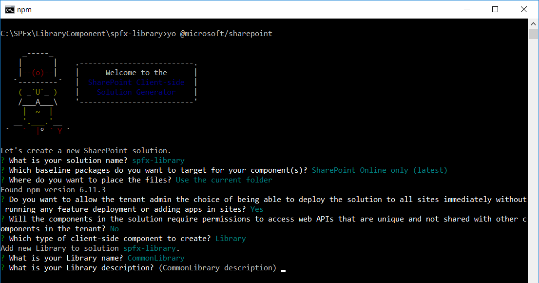
Yeoman generator will present you with the wizard by asking questions about the solution to be created.
-
To avoid localhost port conflicts on gulp serve, open
config\serve.jsonand set the port to any number other than default port 4321. For more information - SharePoint Library Components – Simultaneous Parallel Development{ "$schema": "https://developer.microsoft.com/json-schemas/core-build/serve.schema.json", "port": 4322, "https": true } -
On the command prompt, type below command to create a local npm link to the library.
npm link -
To run the library component (without opening a browser).
gulp serve --nobrowser
Implement Consumer Web Part
Let’s implement a web part named spfx-library-consumer to consume the above library component.
-
Run the Yeoman SharePoint Generator to create the solution.
yo @microsoft/sharepoint -
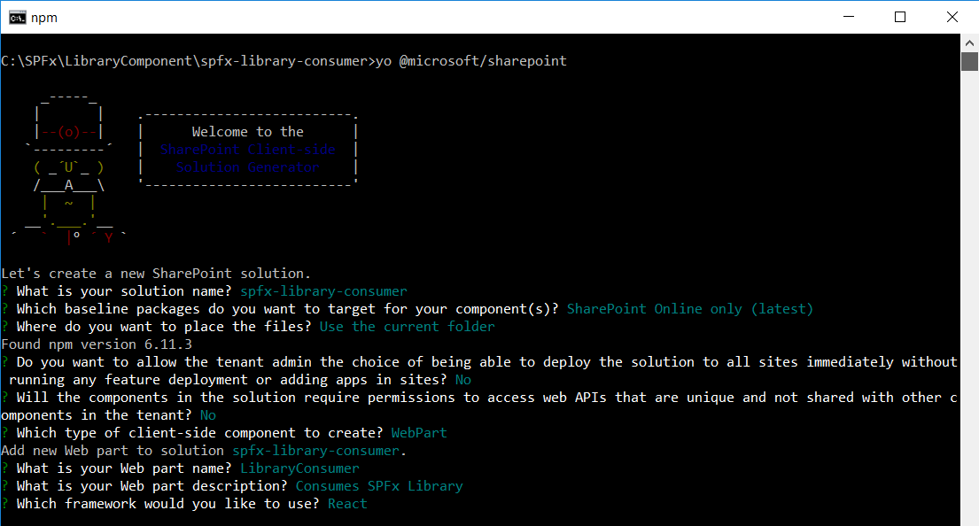
Yeoman generator will present you with the wizard by asking questions about the solution to be created.
-
On the command prompt, symlink a library component by running below command.
npm link spfx-library -
Type below command to open the solution in the code editor of your choice.
code . - Open file “src\webparts\libraryConsumer\components\LibraryConsumer.tsx”.
-
Import the library component.
import * as myLibrary from 'spfx-library'; -
Refer library inside render method.
public render(): React.ReactElement<ILibraryConsumerProps> { const myInstance = new myLibrary.CommonLibraryLibrary(); return ( <div className={ styles.libraryConsumer }> <div className={ styles.container }> <div className={ styles.row }> <div className={ styles.column }> <span className={ styles.title }>Welcome to SharePoint!</span> <p className={ styles.subTitle }>Customize SharePoint experiences using Web Parts.</p> <p>My library: {myInstance.name()}</p> <p className={ styles.description }>{escape(this.props.description)}</p> <a href="https://aka.ms/spfx" className={ styles.button }> <span className={ styles.label }>Learn more</span> </a> </div> </div> </div> </div> ); } -
On the command prompt, run the web part solution by executing the below command.
gulp serve -
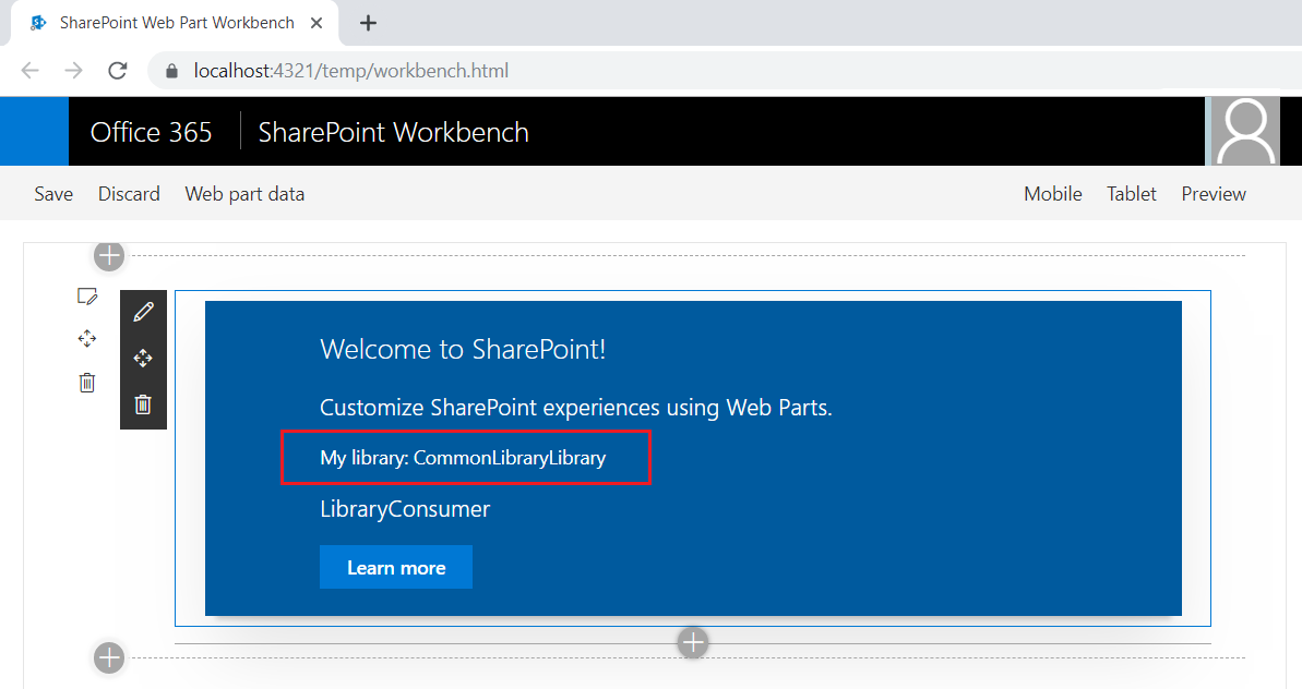
The web part should consume the methods from the library component.

- Open developer dashboard (F12) in the browser to see how the components are loaded.
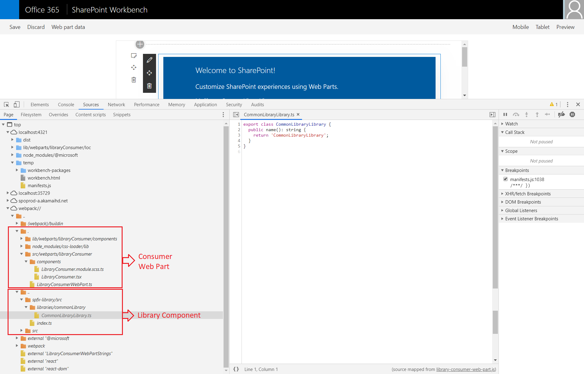
This shows the library component is loaded by default.
Load the Library Dynamically
Consider an example, where we would like to call a method from the library component on click of a button. In this situation, the library does not require to be loaded by default, rather it should be available only when needed (on click of button, in this scenario).
Let us analyze our library loading on the calling component.
Analyze the original import statement (as below).
import * as myLibrary from 'spfx-library';
Let us try to be very specific about what we need from the library component. The CommonLibraryLibrary class contains the methods in library component. The above import statement will reduce to below.
import CommonLibraryLibrary from 'spfx-library';
The old friend - webpackChunkName is helpful here, which will make sure anything in that tsx/ts file will be wrapped up in its own .js file, loaded when this line of code executes.
import * as React from 'react';
import styles from './LibraryConsumer.module.scss';
import { ILibraryConsumerProps } from './ILibraryConsumerProps';
import { escape } from '@microsoft/sp-lodash-subset';
// import * as myLibrary from 'spfx-library';

// Import Button component
import { IButtonProps, DefaultButton } from 'office-ui-fabric-react/lib/Button';
import { autobind } from 'office-ui-fabric-react';

export default class LibraryConsumer extends React.Component<ILibraryConsumerProps, {}> {
  public render(): React.ReactElement<ILibraryConsumerProps> {
    // const myInstance = new myLibrary.CommonLibraryLibrary();

    return (
      <div className={ styles.libraryConsumer }>
        <div className={ styles.container }>
          <div className={ styles.row }>
            <div className={ styles.column }>
              <span className={ styles.title }>Welcome to SharePoint!</span>
              <p className={ styles.subTitle }>Customize SharePoint experiences using Web Parts.</p>
              {/* <p>My library: {myInstance.name()}</p> */}
              <p className={ styles.description }>{escape(this.props.description)}</p>

              <DefaultButton
                  data-automation-id="search"
                  target="_blank"
                  title="Search"
                  onClick={this._loadLibrary}
                  >
                  Load Library Component
              </DefaultButton>
            </div>
          </div>
        </div>
      </div>
    );
  }

  @autobind
  private async _loadLibrary() {
    const dynamicLibImport = await import(
      /* webpackChunkName: 'CommonLibraryLibrary' */
      'spfx-library'
    );

    const myInstance = new dynamicLibImport.CommonLibraryLibrary();
    alert(myInstance.name());
  }
}
Test the library component dynamic loading
- On the command prompt, type “gulp serve” to run the web part.
-
In the browser, open the developer dashboard (F12) to observe the component loading.
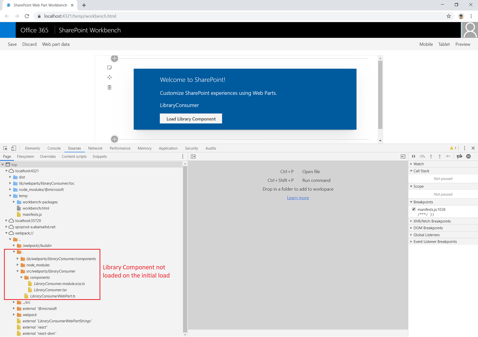
- The page will not load the library component on the initial load.
-
Click the button “Load Library Component”. Observe the developer dashboard.
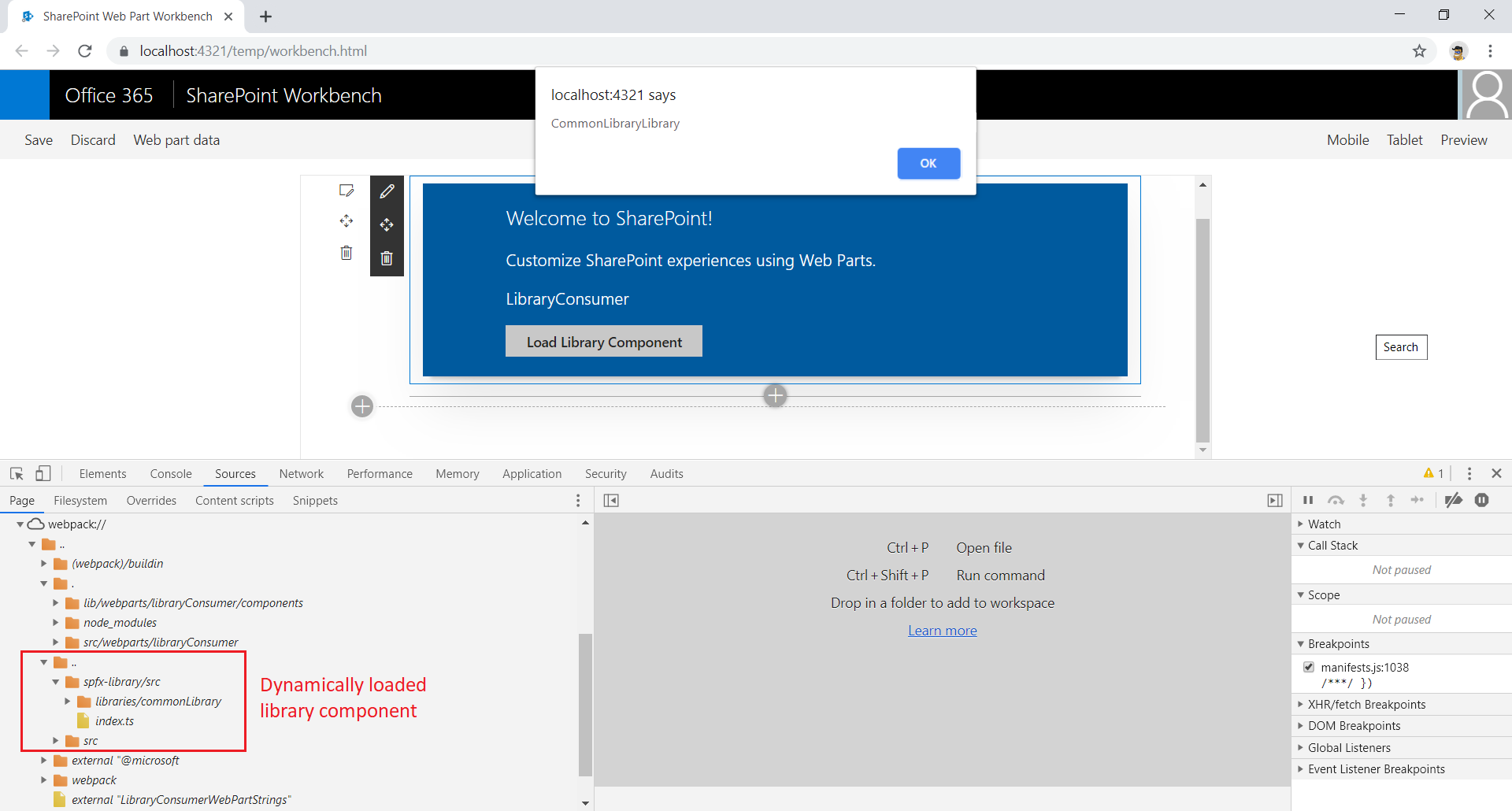
- On the click of a button, the library component loads dynamically and executes the lines of code.
Summary
The library component helps to build independently versioned and deployed code. webpackChunkName is helpful to make sure anything in that tsx/ts file will be wrapped up in its own .js file, loaded when this line of code executes. Importing the library component dynamically in SPFx solution helps to optimize the overall performance.
This content was originally posted here.



Leave a comment