
SharePoint Framework – Theme Colors
Overview
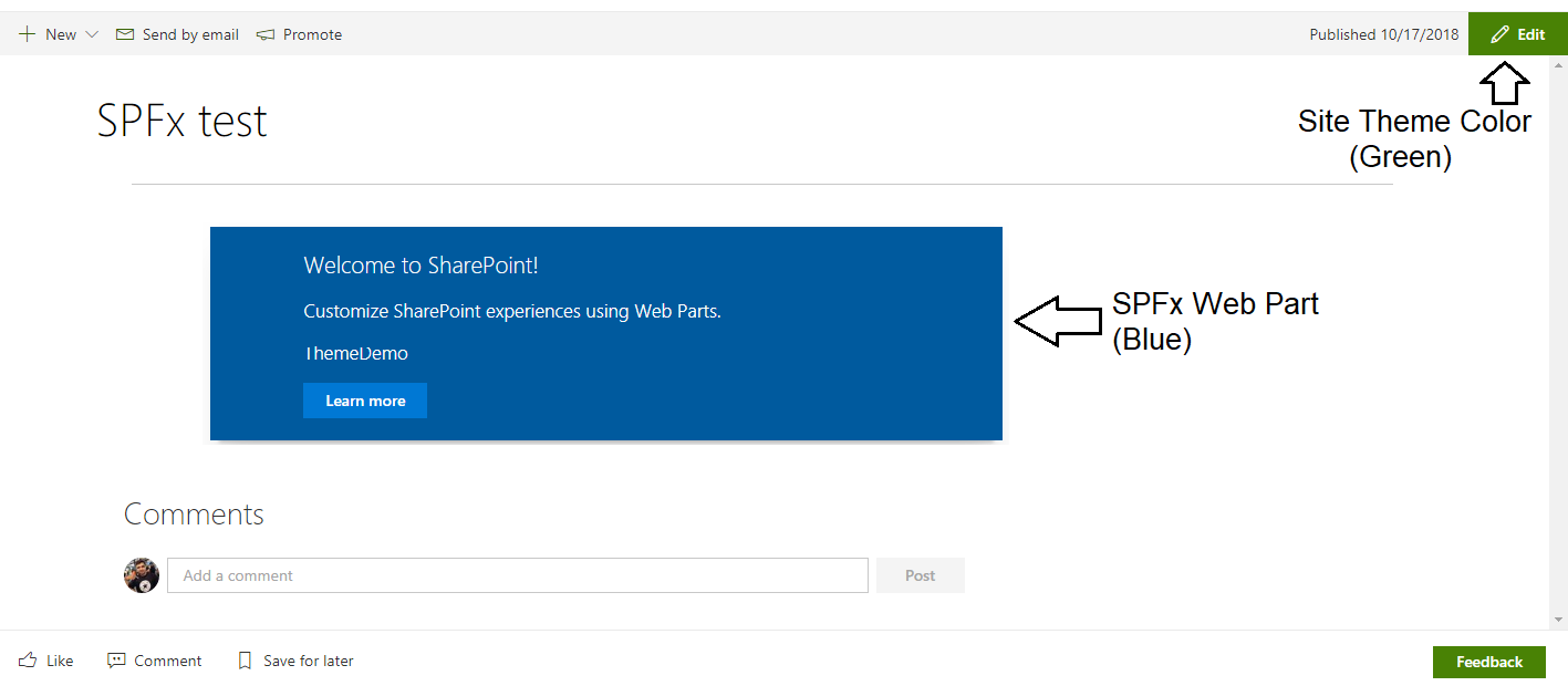
The SharePoint framework client side web part by default uses blue theme color irrespective of the theme color of SharePoint site. If SharePoint site has a different theme applied than blue, the SPFx web part stands out and does not provide the consistent look and feel with the site.
In this article we will explore an option of theme colors to make the SPFx web parts look consistent with the SharePoint site theme.
The Visual Mismatch
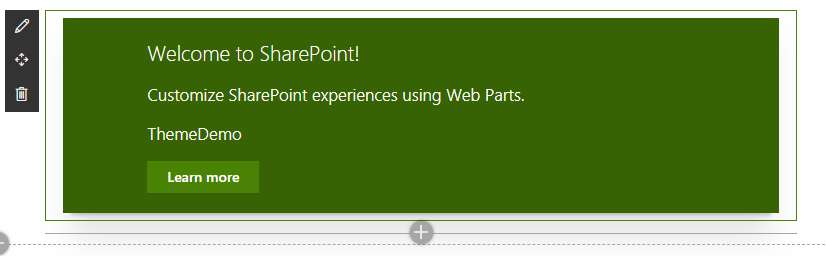
Consider an example that SharePoint site has green color theme. The SPFx web part with default blue color theme looks inconsistent with the site.
Create SPFx Solution
-
Open command prompt. Create a directory for SPFx solution.
md spfx-theme-colors -
Navigate to above created directory.
cd spfx-theme-colors -
Run Yeoman SharePoint Generator to create the solution.
yo @microsoft/sharepoint -
Yeoman generator will present you with the wizard by asking questions about the solution to be created.
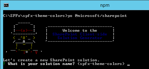
- Solution Name: Hit enter to have default name (spfx-theme-colors in this case) or type in any other name for your solution.
- Selected choice: Hit enter
- Target for component: Here we can select the target environment where we are planning to deploy the client webpart i.e. SharePoint Online or SharePoint OnPremise (SharePoint 2016 onwards).
- Selected choice: SharePoint Online only (latest)
- Place of files: We may choose to use the same folder or create a subfolder for our solution.
- Selected choice: Same folder
- Deployment option: Selecting Y will allow the app to deployed instantly to all sites and will be accessible everywhere.
- Selected choice: N (install on each site explicitly)
- Type of client-side component to create: We can choose to create client side webpart or an extension. Choose webpart option.
- Selected choice: WebPart
- Web part name: Hit enter to select the default name or type in any other name.
- Selected choice: ThemeDemo
- Web part description: Hit enter to select the default description or type in any other value.
- Selected choice: Theme Colors with SPFx
- Framework to use: Select any JavaScript framework to develop the component. Available choices are (No JavaScript Framework, React, and Knockout)
- Selected choice: No JavaScript Framework / React
- Solution Name: Hit enter to have default name (spfx-theme-colors in this case) or type in any other name for your solution.
- Yeoman generator will perform scaffolding process to generate the solution. The scaffolding process will take significant amount of time.
-
Once the scaffolding process is completed, lock down the version of project dependencies by running below command.
npm shrinkwrap -
On the command prompt type below command to open the solution in code editor of your choice.
code .
Set Theme color to web part
SPFx allows to refer theme colors of site. Theme colors can be referred as below:
.button {
    background-color: "[theme: themePrimary, default: #0078d7]";
}
- Open ThemeDemoWebPart.module.scss file from “\src\webparts\themeDemo".
-
Make below changes to CSS classes:
 .row {
     padding: 20px;
     background-color: "[theme: themeDark, default: #005a9e]";
 }

 .button {
     background-color: "[theme: themePrimary, default: #0078d7]";
     border-color: "[theme: themePrimary, default: #0078d7]";
 }
Test the WebPart
- On the command prompt, type
gulp serve. - Open SharePoint site.
- Navigate to /_layouts/15/workbench.aspx
- Add the webpart to page.
-
Web part should have same color theme as of SharePoint site.
Summary
Theme colors helps to develop SharePoint Framework web parts consistent with the SharePoint site without any additional development efforts.
This content was originally posted here.


Leave a comment