
SharePoint Framework – CSS Considerations
Overview
SharePoint Framework (SPFx) client side web parts are light weight and works on both classic and modern SharePoint sites. Look and feel is an integral part of the web part. CSS (Cascaded Style Sheets) helps to apply better look and feel to SharePoint web parts.
Office UI Fabric helps to design seamless experience in Office 365. However in certain scenarios we also have to override few default CSS classes offered by Office UI fabric and SharePoint Framework
In this article, we will explore the common CSS considerations while developing SPFx web part and how to override the default external reference classes from other components when needed.
Manage CSS files in SPFx solution
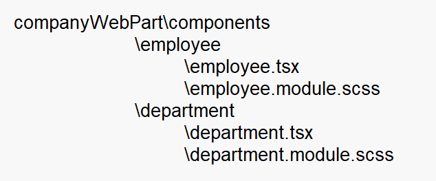
SPFx solution consists of many components. Each component should be isolated and can be used individually when needed. Considering this CSS styles used by the component should be stored along with other assets used by that component.
Below is the recommended structure of SPFx solution based on React that uses multiple components.
Use of Sass
SharePoint Framework supports both Sass and CSS. SASS (Syntactically Awesome Style Sheets) is interpreted or compiled to CSS. Sass is superset of CSS and allows to use variables, nested rules, mixins, inline imports, and much more, with fully CSS-compatible syntax.
More information about Sass can be found here (https://sass-lang.com/).
Use css classes over id
Each element on a page can be accessed by id or css applied to it. Similarly each element in SharePoint Framework web part can have an id and css.
In real case scenarios we may have multiple instances of web part on a single page. Hence referring the elements by id inside markup might not be a good idea, as an id should be unique.
Below code uses id to refer an element and is not recommended to use:
export default class GettingStartedWebPart extends BaseClientSideWebPart<IGettingStartedWebPartProps> {

  public render(): void {
    this.domElement.innerHTML = `
      <div id="greetMessage">
        Welcome to SharePoint Framework
      </div>`;
  }
}
It is recommended to use code like below, which refers the elements by css class:
export default class GettingStartedWebPart extends BaseClientSideWebPart<IGettingStartedWebPartProps> {
  public render(): void {
    this.domElement.innerHTML = \`
      <div class="${styles. greetMessage}">
        Welcome to SharePoint Framework
      </div>\`;
  }
}
Use CSS Modules
SharePoint Framework web part is just one of the component on SharePoint page along with other web parts or controls on the page. CSS styles of one SPFx web part may conflict with CSS styles of another SPFx web part or other controls on the page.
SPFx resolves this conflict issue by CSS modules. SPFx toolchain processes all files with .module.scss extension and appends a unique hash value to each of the file.
For example if we have below files in the solution.
employee.module.scss
.employee {
     margin: 1em 0;

     .text {
          font-weight: bold;
          font-size: 1em;
     }
}
department.module.scss
.department {
     padding: 0.5em 1em;

     .text {
          font-weight: italic;
          font-size: 0.5em;
     }
}
After building the project, above .module.scss files gets converted to css files in the lib folder as below:
employee.module.css
.employee_f6071de4 {
  margin: 1em 0;
}

.employee_f6071de4 .text_f6071de4 {
  font-weight: bold;
  font-size: 1em;
}
department.module.css
.department_2f9c53f0 {
  padding: 0.5em 1em;
}

.department_2f9c53f0 .text_2f9c53f0 {
  font-weight: italic;
  font-size: 0.5em;
}
The css class generated is unique. Even though there is same CSS class name being referred in different web parts, the hash value generated makes them distinct.
Override external referenced CSS
We refer various components in our SPFx web parts like Office 365 UI Fabric, or any third party UI components. These components comes with their predefined CSS. We many need to override any of CSS class of externally referenced component. In this case, we can use global keyword to override the CSS class in our .module.scss file as below:
// Make workbench canvas use full page width
:global(#workbenchPageContent) {
    max-width: initial;
}

// Override third party SuperTreeView CSS
:global(.super-treeview > div > .super-treeview-node > .super-treeview-node-content > input[type=checkbox]) {
  -webkit-appearance: radio; /* Chrome, Safari, Opera */
  -moz-appearance: radio;    /* Firefox */
}
Summary
SharePoint Framework web parts supports Sass and CSS. Each component should have its own CSS references to maintain the isolation. Always refer the elements by CSS class instead of id. The external CSS styles can be overridden using global keyword.
This content was originally posted here.
Leave a comment